FollowinGreat
by adriana.torres • Uploaded: Nov. 08 '11

Float
(Floaters:
1 )
Description:
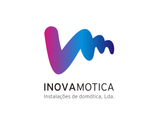
Logo developed for a portuguese coaching companny.
The logo represents strenght, it has a V shape (victory) and all the curved lines represents the ups and downs trought the process until the goals are achieved.
As seen on:
Followingreat
Status:
Client work
Viewed:
2574
Share:


Lets Discuss
Please login/signup to make a comment, registration is easy