Description:
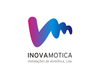
The logo was designed taking into account the initials of the brand, 'I' and 'M'. At the same time that it was intended to be dynamic and forward the technological nature of the brand. Thereafter the initials were reconciled in order to represent a hand touching a touch screen.
The simple lettering contrasts with the symbol and balances the brand identity.
Status:
Unused proposal
Viewed:
3689
Share:


Lets Discuss
like it. very simple and beautiful!
Reply:) thanks!
ReplyPlease login/signup to make a comment, registration is easy