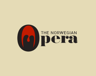
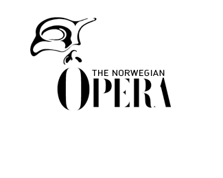
Ooopera
by actiondesigner • Uploaded: Mar. 03 '10

Float
(Floaters:
7 )
Description:
alt. type treatment. The O as the mouth
Status:
Unused proposal
Viewed:
2119
Share:
Lets Discuss
Same concept as the More logo...anyone have a link?
ReplyAnd the More logo is mine (http://logopond.com/gallery/detail/42582)**...by all means - go through my logos to see if there is anything you like? Or how about commenting on my More logo and say its similar to the Opera logo? Just a fun experiement with ooooooooos in Opera ...just as Moooooore. I really dont mind you giving critique - but when Its all down that road and no praises you are really giving some wrong agendas - but that might be just me!
ReplyWoops! That's what happens when I don't take the time to look. Hehe :P
ReplyThen go on over there then to see if you actually have the ability to like something and not just rant? Obviously the More logo made quit an impression??
ReplyJust because a design made an impression on me doesn't necessarily mean I liked it. I remember a ton of designs regardless of how much I like or dislike them.
ReplyMY POINT IS ...do you have anything cunstructive to add - good or bad? Until now its been %22something seems of%22 %22it reminds me of the more logo, anyone have a link%22 and %22Published last year? I still find it very strange it is uploaded right after Danzk makes the gallery%22 NOTHING constructive - just out to get one. And I figure you a designer of some sort, maybe not that old - but I would expect that when you do find the time to comment then you want to offer something CONDTRUCTIVE which can be of use to me. If you cant admit the balance in your comments then I would rather you kept your mouth shut. U kinda missed with the More logo. And not to sound cocky - admit that the More logo is good:)
ReplyJoe just wanted to help! :-) **IMO he seeks for the potential rip offs too hard...
ReplyIn all fairness, I think designers need to add something to the description if the piece if it is based on one of their previous works. It gets confusing sometimes.**That being said, I'm not really feeling this one. Your first more concept was much better executed, imo. And why the semi-colon? Wouldn't a normal colon be better to represent eyes?
ReplyDescription smitchion .. yawn ... open your eyes before crying wolf
ReplyOr, you could spend an extra two seconds typing and avoid the issue altogether.
Replyor ...you could see my other conecpts regarding The Norwegian Opera and see that they are actually different concepts all together. Jeez. I actually didn't have my More logo in mind at all. The O is a mouth guys
Reply...and why the long description all the time?? Just fed up with a sertain persons anal mindset
Reply@ chad yawn - open your eyes - you dont need your hand held all the time surely ...
Reply@ actiondesigner sorry for the posts
ReplyI like this Actiondesigner, reminds me of my mother in law (she has a big mouth). what does it look like vertical, say that would be an interesting optical. What's the type? Custom or modify, I like it anyways.**Anyway the force is with you always brothers and sisters of planet logopond, now group hug and lets sing the first verse of 'we are the world' and stop this fussing and a feuding.**
Reply@chat. The semi colon kinda gave it a corny look, made it a bit funnier IMO. Often opera singers close their eyes when they hit that high note. That was my first intention. Had some different eyes but it ended up reminding me of Boris Hoppek so I skiped it and went for this. Good points though Chad!**Thanks antyclymax %26 mcdseven (you still got dibs on some posters when they (eventually) are done)
Reply@mcdseven. The type is custom BTW
Reply@Type08: Right:) And this fat lady hopefully can't sing
ReplyPlease login/signup to make a comment, registration is easy