Description:
(NB! Answer is revealed further down in the comment field)
.
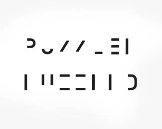
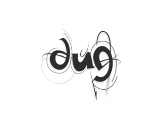
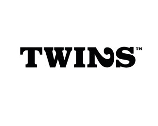
Logo for an exhibition. This is one of those logos where either you can read it at first glance ...or not. This logo is eventually going to reveal itself. I havent given it a name because that would give away everything:-) This logo is featured in Tres Logos (Die Gestalten Verlag)
Status:
Client work
Viewed:
23154
Share:

Lets Discuss
can i say it? :))*cause i got it
Replylol coool .....
ReplyI don't get it. :(
Replyhaha kevin dont get it lol
ReplyWTF someone help me out here!
Replythat is brilliant, took me ages to work out!
Replycan't read it either :(
Reply@ nido : What you hit 100 and think you're cool or something? :-P
ReplySorry Dude...but I can't see it either.
Reply@ ocularink**LOL... ive always been cool lol...
Replyok nido i give up. email me**bart@senterbrands.com the only thing i have i think mihght be the first word.
Replythis is an awesome play with typography - guys don't give up so easily
Replythis is brilliant, at first i could read the top one, but then i realize what the bottom one is :D**very nice
Replyi got it. clever.
Reply:) i think it's cool the way it works. you'd either get happy working out what the logo says or end up in a state that the logo wants you to be. not elegant enought for me but effective. good job!
ReplyUgh, I don't get it either.
Replyvery good job ! congrats
ReplyThis logo doesnt work if/when you can see it :)
ReplyIt doesn't work because most people don't get it, and those who do, take time.**It's not describable.
ReplyDamn, it made me crazy. *Finally got it. And its great!***Nice one, Morten.
ReplyHiding a name behind a mind game is not so effective, I think.**Most of people will be upset not understandign what it is and it is not giving any immediate information as a logo should do.**BtW: It is PUZZLED and you should combine the upper line with the lower in order to reconnect lines and letters.
Replyyou spoilt it .... damn looool ... personally i think a unique approach and fun given its application, who says design can't be fun !!
ReplyI will comment more elaborate at a later time ...but seriously%0D*%0D*@spasquini%0D*im a pationed guy, but why the hell would you go about giving away the solution? I don%7Ct mind critisism ...I knew what I had coming when I posted it. I will post back at a later time explaining the logo and also why a logo can be much more than just a mark. Maybe thinking outside the box for once, maybe do something unexpected for once, maybe make someone angry, sad, happy with your design for once. Cirst ...we are designers ...dont we want do do something different, break the rules of what is common and boring. And maybe design something that has a function ...not just sits there as a boring pretty paining on the wall that no one cares about the 2nd time they see it???
Replywell put ...
ReplyOH spasquini,you should'nt of done that.Dude half the fun with something like that IS trying to figure it out.Actiondesigner,this is genius.
Replyyeah thats a shame... your like that guy who spoils agood joke.. or see's a magic trick %26 then starts shoutin out how its done... killin the mood... or the guy that cried wolf... hang on.. no, no thats something else... your like homer when he robs from ned... ive lost it now!
ReplyCreative x10
ReplyI say you delete his comment anyway, Climax.
ReplyI was about to suggest that you could delete the last part of pasquinis comment ...remove the anti- and bring back the climax :-)
Replydont delete it then.. just to keep the flow... blur out the bit that has the answer lol... it'll make it even more mysterious...
ReplyI got the top line but not the bottom until I read the answer which seems like a problem most people were having.***In the end, only using the top line might be the best solution. If you can get the concept with the top, considering the subject matter, wouldn't less be more?****
ReplyI disagree, I think it needs to have both lines. Keep in mind, the concept suggests that the pieces need to merge together to create the final solution. And just for the record, I got it before dude posted the answer. Haha...shut-up Nido. :-P Simply BRILLIANT!!
ReplyWise policing Climax. And great work there Action. I printed this out and passed around my peers. It annoyed the hell out of them! Good stuff mate.
ReplyHi.. New member%3B signed up just to comment on this. Nice logo, actiondesigner. I suggest, Climax, that you put a 'SPOILER' warning on spasquini's post. He should've done that himself.
Replyi was trying to make two different words :s
ReplyOk, here's a clue if you will use your imagination from up to down you will get the word.**For me first time i saw the logo i solved it for just 5 seconds. :)
Replyi like the idea. **but i agree that the seperation is a little too much for branding purposes.**perhaps reducing the spacing more so that its easier to tell or giving away the letters in some cases to make the connection easier.
Reply@spasquini: not cool man...%0D*%0D*I figured it out without, looking at the answer, very clever dude!
ReplyI figured it out without looking at the bottom line... but then it took me a while to figure out the hell bottom line was, haha. great stuff man.
ReplyI kept trying to say %22Pulled Apart%22 but then it hit me what it was. Clever.*i like it.*
ReplyI don't understand how so many of you (especially the good designers) didn't see it right away. Come on guys, it really wasn't that hard. The average Joe wouldn't bother with it, so unless the audience is smarter than most of us, the logo probably wouldn't work. Nice text play though.
ReplyTook me a few seconds to work this out. Its very clever, but I couldn't see it working. could be interesting to use in jigsaw puzzles branding as you have to join pieces together to get the picture!? nice. :)
ReplyWanna know the answer is? Well here it is:**Note: Don't open it first unless if you really don't know it. (Newbs)***http://img528.imageshack.us/img528/4978/232sv6.jpg
ReplyI could not figure it out myself :(*I'm a newb. I only got the first and last two letters. Very cool!
ReplyI saw the word but only from the first line, I thought the second was another word :))) Weird huh? :PPPPP
ReplyIT SAYS %22PUZZLED%22 YOU DUMBFUCKS
ReplyGROWN UP!
Replyvery clever!
Replynice i found out in 5s ... feel talented now :D nice toy ...
ReplyWow! :D really cool idea!
Replythis deserves a bump (another look)
ReplyThanks raja. Made quite the stir right%3B-)
Replyyou need to animate this!
Replytook me a moment but I see it! awesomeness!
ReplyI second that bump. Quite the stir indeed, action. What a brilliant design!!
ReplyYou know ...I have actually ...in theory that is. I did a five frame snapshot when I presented it ...to show the pieces move together**About the concept. The first part was the invitation. They would first receive one part. The second part they would receive either upon arrival or later in a second handout.**Also ...the businesscard or brochure have both parts. You are abel to put them together yourself. Just place them on top of each other. That is why I think this logo is so successful. Because you would be able to read this whenever you felt like it. They are constructed to fold or overlay each other. The first part of the concept was just to draw attention. Make you puzzle. That is why its so funny to read a lot of the posts. Dont blame them though.
Replytotally badass
ReplyThis is not a bad remark but I saw immediately what it was because this trick was somewhat done about 20 years ago by a very avant garde - but alas not evolved - palm maker which went/goes by the name 'Psion'%0D*%0D*Their logo was never beautiful but very intriguing. http://www.spencer.nildram.co.uk/
ReplyI like it. Got it pretty quick. If you want it to still be puzzling but easier to solve moving the two lines closer together could help.
Replyfunny. :) i deciphered the first line immediately, but have been trying to find the hidden message in the second line for a long while...
ReplyTwo floats... WTF! Added a third, brilliant :)
Reply@NeilMcDonald*first ..thanks for liking it:) I remember this caused quit the stir when I uploaded it. (read through the comments:)) Must be one of the most looked at %22logos%22 on the pond. And it divided the community into %22I like%22 and %22I hate%22. %22I hate%22 where either people not getting it (taking it personal) or people not seeing it as a %22logo%22. That its not legible or doesnt fit the predefined rules that people may have of what a logo should or should not be. Dont want to go over this again:) This LOGO:) fits the concept it was intended for. :)
ReplyWell said. And well done for getting it into Tres Logos. Great book. :)
Replymerci:) Not to brag, but waiting for %22Los Logos 4%22 being shipped to me. Got another 7 logos into that one. Very exited
Reply%5E no that's bragging, but we understand. Congrats.I would be too.
ReplyAlways liked this one, clever concept :)
ReplyJust re-found this. 100%25 precision win of a logo. Distilled genius. I love it more than bacon. *
ReplyVery nice, very creative, congrats!!!!! you have achieved the very escence of logo design
ReplyPlease login/signup to make a comment, registration is easy