Description:
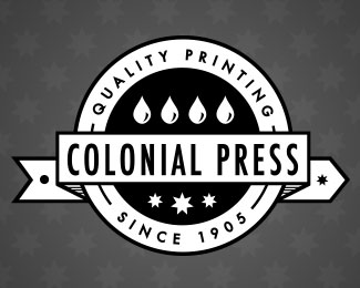
Identity for a Nebraska-based printing press. The press has been around since 1905 and is known for quality printing.
The ribbon of paper behind the words 'Colonial Press' symbolizes the paper as it's run through the press. The four drops symbolize traditional CMYK inks. And the seven pointed stars symbolize the seven values of Colonial Press. In addition, the circle loosely represents reams of paper and/or rollers involved in the printing process.
Any thoughts or constructive criticism is greatly appreciated! Thanks!
Status:
Work in progress
Viewed:
1798
Tags:
print
•
printing
•
identity
•
press
Share:

Lets Discuss
I like the direction of this. I do have one suggestion. I'm curious what the banner would look like with a black background and white letters and rivets and then the inner circle reversed out as well with CMYK droplets. I bet they would really pop. My 2 cents. Again, nicely done.
ReplyPlease login/signup to make a comment, registration is easy