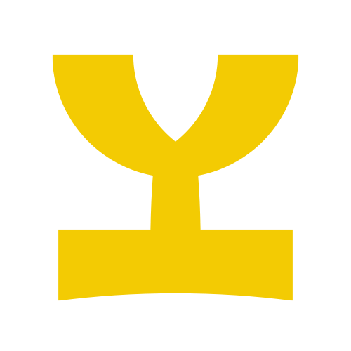
LavaVane
by Yurik • Uploaded: Mar. 15 '16 - Gallerized: Mar. '16

Float
(Floaters:
47 )
Description:
Logo for clothing brand.
Status:
Unused proposal
Viewed:
6604
Tags:
arrow
•
dragon
•
weathervane
Share:
Lets Discuss
TavaVane?
ReplyI kind of agree with Nikita, the "J" could use a bit more definition on the lower end.
ReplyOtherwise, love the color and style of this!
ReplyNikita, thanks for remark. I'm thought about this. May be it seems so because cut corner on the stem.
Replyluberadesign, actually it's "L", not "J" =) Thank you!
^ The cut stem AND The cross bar on top make it feel like a T.
ReplyYes I agree. reads as TavaVane.
ReplySorry, must have mistyped that. What I had meant is that I think the lower branch of the "L" is there by necessity, whereas the mirroring branch of the "E" is for style and balance purposes. Thus it looks like they are both non-text design flourishes.
ReplyAgain, much ado about something very minor. I think a few tweaks will make this one good to go. :)
Please login/signup to make a comment, registration is easy