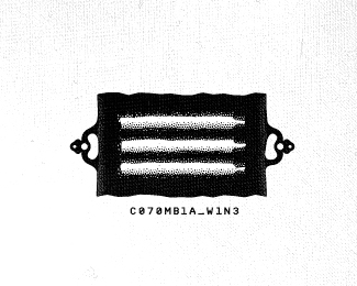
day 71 - missing rocks
by Wizemark • Uploaded: Mar. 14 '10 - Gallerized: Dec. '10

Float
(Floaters:
99 )
Description:
↓more info↓
As seen on:
365logoproject.posterous.com/day-71-missing-rocks
Status:
Unused proposal
Viewed:
12841
Share:


Lets Discuss
amazing style
ReplyLoving this one!
Replyrealy nice mark!
Replyrealy nice mark Srdjan!
Replysorry%5E bug, but this work can be several times praised :)
Replylike the style here...
ReplyGreat concept, great execution.
Replyvery cool, bud.
ReplyLoving it...:)
Replyawesome
Replyyou are ridiculously good at this logo design business!
Replyvery nice mark and execution. i'm not sure about the type though.
Replygreat style. as usual. love it.
ReplyBeautiful mark and very nice concept but I agree with Andrei - type is totally off... Something more simple (and bigger) would let this illustration really take over...
Replylove it!
ReplyThanks a lot, guys!!
ReplyFantastic style!
Replyjust gorgeous!
Replywhat happened to this guy?
Replylove this style.
ReplyThanks for the comments, guys. And thanks for the spot.*Mike, guy was working harder than ever in August and September, got burnt out, got divorced in the meantime, moved to another city and now finally settled in again. He%60s also planning 30 days trip through Vietnam, Cambogia and Thailand to reset himself a bit. How%60ve you been? :)
ReplyI have %22empathy%22 for you there and completely understand. Hope to see you and more of your awesomeness around soon.
ReplyAgree with Mikeymike -- great style.
Reply%5Editto. Nice job mate.
ReplyWonderful logo! I think it's great that you can create a logo out of a mundane thought %22what happen to the rocks thrown out to the lake?%22 :-) Simple things in life.
ReplyLove the playful style and lovely colour choice.
Replyyes excellent style and use of colour... very nicely done... I would like to see the type more in line with the image however.. but good stuff nonetheless...
Replyappreciate the comments, guys! regarding the type.. ye, maybe one day, not in a mood to fix yet to create somethin these days :)
Reply%5Elol.. I didn't mean right away...
ReplyPlease login/signup to make a comment, registration is easy