Description:
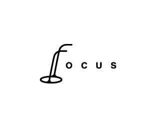
Custom logotype for a furniture company. Done through KNB studio.
As seen on:
www.wizemark.com
Status:
Client work
Viewed:
6746
Share:


Lets Discuss
really like this, what is it for?
ReplyI like the font in the first one better as well.
ReplyGlad you do, Florin. It%60s done for a furniture company.*Thanks, Pierro.
Replyooh, nicely crafted.
Reply%5E I second that!
ReplyGood work Srdjan!
Reply@Roy, Alen and Vladimir - Cheers, guys!
ReplyUpdate: this is final and approved design.
Replygood choice, love this!
Reply%5EMe too. Nice to hear about the approval. Congrats!
ReplyPleasant type-play Srdjan.
ReplyWise choice.
ReplyGreat choice. Congratz!
ReplyNice work Srdjan. Great readable in unusual form.
ReplyThanks, lads.
ReplyI will not float this one because it beated the one I really liked.*Now I actually hate this one! :)
ReplyCongrats man. I really felt the one with the table was the strongest.
ReplyAwesome stuff man.
Replynice, Srdjan. Custom type that fits the industry so nicely. love it.*The client had some great choices. nice work.
ReplyVery nice work Srdjan!
ReplyLooks great Srjdan!
ReplyI had bit of readability issue in the first glance.. but it looks very strong after a while!
ReplyAppreciate the love, guys!
ReplyI've got much love for this! Clean and nice font play.
ReplyFantastic type!
Replyit looks so good
Replyclean and classy. very strong type.
ReplyAppreciate the comments, guys..
ReplyBrilliant..like it.
ReplyPlease login/signup to make a comment, registration is easy