Description:
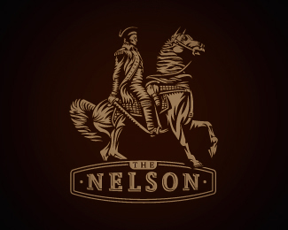
Had a client that felt in love with Soverinn logo and had a concept in mind before seeing Soverinn logo. So, aside from the two guys riding horses and wearing quite the similar cloths, she wanted me to apply exactly the same treatment on her logo. Luckily, i`ve managed to talk her out of that idea and now these two can stand together, i think. This is done for a new b&b based in UK. And the guy here is Lord Admiral Nelson, a famous British hero.
As seen on:
www.wizemark.com
Status:
Client work
Viewed:
11607
Share:


Lets Discuss
insane illustration..
ReplyAha local boy Nelson. Norfolk born and bred.
ReplyReally great illustration, Srdjan. The mark seems very overpowering to the type though...
Replynever know Roy... one day they may have a big statue of you placed in a square here %3B)
Reply%5E hehe. Please put one up for me if I peg it.
Replyfantastic work! in love with your style, mate!
Replybig skills, Srdjan. NICE!
ReplyI QUIT!
Replyamazing wize, congratz
ReplyIs the word overskilled in the dictionary yet? Impressive work!
ReplyWOW...love it...absolutely worship %22soverinn%22 and this one...%3B-)
ReplyThanks, all! I appreciate your comments, guys.
ReplyIf I were to work on ANYTHING on this piece I would take a closer look at the xpresion on the horse. He looks to have a Homer Simpson type expression - I would make it more serious somehow.
ReplyMake that Scooby Doo!
ReplyFantastic illustration work Srdjan.
ReplyIt is very well illustrated, superb work! :)
ReplyThanks, guys!!*lol @ danny
ReplyToooo good!!
Replythis is so good..
ReplyThis is a bomb! Great posing, unique style and amazing details. Damn, for me this is like sunshine on a cloudy day :)
ReplyGreat work!!
ReplyThanks, guys. Appreciate it.
ReplyVery good craft
Reply%5EThanks.
ReplyVery well executed. It's hard to convince clients that they don't need to look EXACTLY like someone else, but can still have the same style. And the illustration style shows that logos can have complexity as long as it's done well.
Replywooooow very very very very nice Detail
ReplyWow-WOW
ReplyPlease login/signup to make a comment, registration is easy