Description:
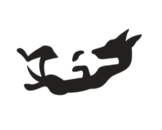
Winery logo. Exploring negative space.
Update: Slimed down the bottle and made some slight adjustments to the ears and nose.
Status:
Work in progress
Viewed:
16190
Share:


Lets Discuss
I dig it. Nice one Will.
ReplyExcellent stuff!
ReplyI think that it won't let it go quite that easy :)
ReplyThis is brilliant man! :-)
ReplyDrunk dingo. :-)
ReplyThis is really great.
ReplyFantastic concept!
ReplyJust awesome!
ReplyReally great! would love to see some type to it.
Replywow, this is realy nice :)
ReplyHoney doggy with the wine!
ReplyThanks guys for all your comments… still working on the type!
Replynegative space is king!*nice one.
ReplyAmazing!)
ReplyVery nice!
ReplySo good.
ReplyYeaaah, agree with all, just awesome!
ReplyGreat piece!!
ReplyNice!***
ReplyThis is a great logo, my only suggestion so it becomes a classic is: usually the wine bottles are a bit narrower, if you could manage to make that correction, you have a WINNER!
Replycould work for the fifth leg brand. nice.
Replyclever
ReplyI love it work!*I can to private it's?
ReplyNice design, I like this effect!
ReplyMasta Kila!!!
ReplyCool*!!!
ReplyHe he he... this is great!!!!!!!!!! :-)
ReplyNice use of negative space even if it is mildly phallic.
ReplyPlease login/signup to make a comment, registration is easy