Description:
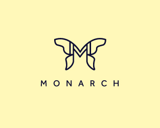
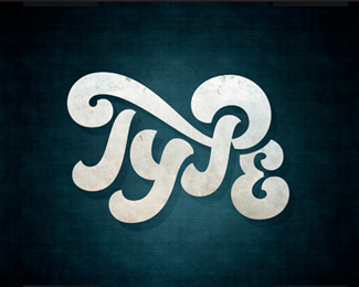
Final version of a logo for a jewelry shop.
Status:
Client work
Viewed:
9885
Tags:
jewelry
•
jewel
•
letter
•
M
Share:


Lets Discuss
not bad at all!
ReplyI like it. However, what would make this an absolute killer mark is if you get rid of the M inside the butterfly shape. The particular way you drew that butterfly already suggests an M shape, so IMO, adding that M inside it kills its subtlety.
Replyvery much agree with Jon. ^
ReplyPlease login/signup to make a comment, registration is easy