Metro Sky II
by VR4Jen • Uploaded: Jul. 15 '08 - Gallerized: Jul. '08

Float
(Floaters:
11 )
Description:
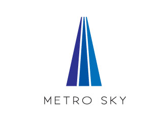
Logo concept for new high-rise condominiums in downtown Los Angeles
Status:
Student work
Viewed:
8326
Share:

Lets Discuss
nice but I think the verticals need connected or you need 3 on each side to resemble an M.
ReplyType needs work. Spacing,kerning.
Reply%5EThe above comment is bothering me because I made sure that there was perfectly even spacing between each letter. I'm not sure where you are seeing the faults. This was done for one of my logo classes and the teacher never made any such comments, and he's a kerning nazi. %0D*Unless you are referring to your dislike of the overall tracking width... which is an entirely different subject on its' own.
ReplySorry to agree, but for me, there is too much space between the 'E' and 'T' - 'K' and 'Y' - and too cramped between the 'M' and 'E'.**Really like the mark though.
ReplyYeah, I can see now how the M and E could be too crowded. I still think %22SKY%22 is fine. This is one of the first logos I ever made so I definitely would have made a couple tweaks, looking back. Thanks for the help, guys.
ReplyThe space is never equal between letters when properly kerned. Tip: to check kerning squint at it and just let your eyes soak up the negative space around the letters. You'll see it every time.**But even after 18 years, I still look back and see stuff that bother's me. It's like a typo...you don't see it until it's too late!
ReplyPlease login/signup to make a comment, registration is easy