Float
(Floaters:
10 )
Description:
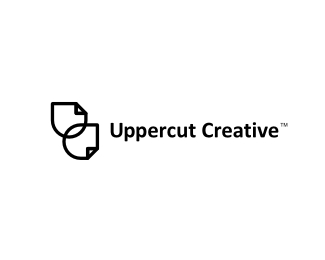
Unused logo proposal for a marketing agency from Canada.
Status:
Unused proposal
Viewed:
4461
Share:

Lets Discuss
Ok I get the shapes, but a lovely idea would have been to use the U with a fist? Probably to obvious...
ReplyHeh Paul, that what comes to mind when client with 'uppercut' comes to you my friend, but he STRICTLY asked not to have any ties with that boxing term!!! So you just work on it and don't ask any more questions (that's my advice)...
ReplyNah David, all good, just wanted to say that it was a really strange part of the brief where client stated how he was inspired by that term but wanted to avoid any connections with it. I just commented to him that brand name is already 'there' and that like 99%25 of the people who read it will have that connection in no time - and he agreed!?! But brand name stayed as it is and I got the guideline not to use any boxing icons and that what 'don't ask further questions' meant here...
ReplyGuessing the client wants to be 'different' but still pack a punch %5Bpunny, I know%5D. How about an abstract shape, like a rising star/rising fist, with a motion trail %5Bsort of like the motion trail of a mouse pointer%5D...? I think it's going to be about movement with your client -- moving forward, moving ahead, progressive thought....it has possibilities. I did something similar myself once. I might post it later to show you what I'm talking about. %0D*%0D*Good luck with it.
ReplyJF, this was 8th concept. I did a logo, client changed specs... I did another logo, client changed specs... So we looped for months and this is something like a final result that I sent to him 40 days ago... He still marinates on it... Reminds a lot of this video here: http://usedwigs.com/video-stop-sign-designed-by-committee/
ReplyThat's the most bizarre creative direction I've ever heard. The client chooses a blatant boxing term for his company name but doesn't want the icon to be associated with that term at all.**Oh, btw - next week I'm planning on opening up a restaurant called %22Nothing But Steak%22 but I'm going to use a light bulb icon for my logo because I don't want people to think that steak is on the menu - because it's not. You're all welcome to come to the grand opening.
Replythats a pity... uppercut when executed leaves the person stunned! There is so much your client could have done if he allowed you to push the boundaries, seems like one of those jobs.
ReplySteve and Paul, EXACTLY! Couldn't agree more with both of you, thanks for making it even more clear!
ReplyThat video is hilarious. %0D*%0D*I hate clients like that. That's why I tell them from the _start:_ 3 revisions %5Bor how many I see fit for the project%5D...and after that you pay me more money. Either by the hour/revision. Usually, when there's consequences, they stop fooling around. You're probably too nice to them. %0D*%0D*Everyone wants to be the creative. That's why clients need to be given their role from the start -- so, so much I could say about this. But, I'll sum it up with a quote from Paul Rand. When Steve Jobs worked with Paul Rand, legendary designer, he asked Paul if he could 'come up with a few options for %5Bhim%5D.' Rand's response?%0D*%0D*%22No, I will solve your problem for you, and you will pay me. And you don't have to use the solution -- if you want options, go talk to other people. But I'll solve your problem for you the best way I know how, and you use it or not, that's up to you -- you're the client -- but you pay me.%22%0D*%0D*There are no options that clients have to 'see' and then 'maybe decide' if they want to use them. That's called, in all honesty, spec work. The design industry is unique%3B clients pay us for solutions, not to do their bidding. We are the braintrust%3B they are not. We are the ones who control the creation, and creativity of the project%3B they do not. We are the ones who produce a final product%3B they do not. That's where their good faith and belief in our competence comes in%3B they can either accept it, or move on to someone else. %0D*%0D*This is why I recommend...always...setting boundaries from the beginning of a project, and positioning ourselves as consultants and experts who _need not be trifled with_ from the beginning. Do it in a nice way, with a smile, but with the utmost confidence in your abilities, and you'll never have to deal with a jackass client again. Good luck with this guy%3B he's probably a lost cause. I say, cut your losses and move on.%0D*%0D*P.S.: Sorry for the long post. But it's something I firmly, _deep-down_ believe all good designers should know and practice. Once again, good luck with this client. %0D*
Reply%5E%5EHa! What a ride... %22Ding!%22*Dig the mark, sorry to hear about the trouble... :)
ReplyThanks Michael! Yep, we learn more and more from every project...*Someone once said: client/customer is a master, but that doesn't make you a slave...
ReplyAnd, you know, your work is quite nice. Too bad this client was such a nightmare.
Reply%5E%5EDarn straight %3B)
ReplyOh my...your a stronger man than me Alen LOL
ReplyThanks fellas but no probs at all, I can handle it! %3B) And all my clients are pretty aware of that.
ReplyPlease login/signup to make a comment, registration is easy