Description:
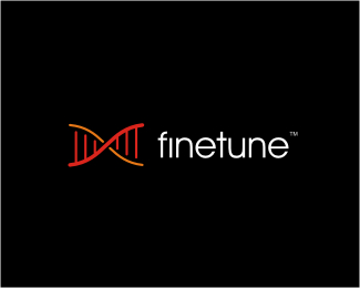
IT systems reparation and maintenance services from Singapore. As the brand name suggests, they tune systems to the core at the finest level, and that inspired us to go with the stylized DNA structure that also resembles an music instrument shape (tuning).
As seen on:
www.finetune.sg
Status:
Client work
Viewed:
11056
Share:
Lets Discuss
I like the mark Alen, but would like to see it all in one color. Looks a little dull with the lighter orange, IMO.
ReplyThanks for the comment Joe! This logo is out there for a while as well, we use those colors for communications needs - I also designed stationery, web concept, birthday cards, brochures, car apps, invoices, stickers, vouchers etc., we need those colors there...
ReplyI didn't even click the link before I commented! Looks way better on the website where it is actually clear there is a distinguishing difference between the colors. Hard to see on LP sometimes. Looks great Alen, awesome work once again.
ReplySome great new additions to your portfolio, bud.
ReplyI also agree that it looks great on the web site.
ReplyKev and Sean, thank you my friends!
ReplyCrazy.. just did something similar the other day.. luckily the client looks like they are going in a different direction.
ReplyLooks amazing on the site!
ReplyIt's great when clients use your logo well.... like on the finetune website
ReplyThe guy that runs Finetune is one of my favorite clients: the communication I had with him should be a model for freelancing! What's up Pheng!! :) I enjoyed working on this project and still am, glad that you all like it!
ReplyUpdated... Decided to show it exactly like on website...
ReplyI think this logo works perfect in real business application, it comunicates philosophy of clients service and I like it very much. I think there is plenty room in whole identity which calls to use this symbol more as texture, graphics element or details, colors are great too. Really good job done. I can say it is seen in this job that you enjoy working on it. Clients good will is there in DNA of idetntity too. Thumbs up my friend.
ReplyDavid and Jan, thanks a lot my friends!
Replyreally nice work... again simplicity is key with a strong punch of visual!
Replyyou know what Alen
Replywhere's the %22like%22 button on this website when u need it.*Amazing profile dude !!
ReplyJoey, Milou and Mathiew, thanks a lot for the support guys!
Replygreat one Alen. i really like both the coloring and the type.
ReplyThis looks great Alen
ReplyNice one Alen. Got the DNA connection straight away.
ReplyYea, very nice Alen - great job of applying it, too!
ReplyAndreiu, Cerise, Chris and Siah, thanks a lot my crew! I'll post the rest of the branding system on my personal site soon, received some printed materials via air-mail and doing some photos as we speak...
ReplyGood stuff dude.
ReplyThanks dude! %3B)
ReplyI like it, nice mark!
Replyhello type08. this is nice one!
ReplySean and Grant, thanks guys!
ReplyHow did i overlook this one for so long?, wish i'd ventured in earlier to see the site link, love the front page execution!
ReplyThanks a lot, Dan! :)
ReplyPlease login/signup to make a comment, registration is easy