Description:
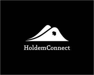
Logo for the poker-themed mobile game for Kitmaker, Spain.
As seen on:
www.kitmaker.com
Status:
Client work
Viewed:
25943
Share:


Lets Discuss
Not that I've seen before! Looking very cool bud:)
Replyvery nice!
ReplyFabio and Niall, thanks for stopping by guys! Really hod to check it out since that subtle poker move of reading/viewing cards is very common... Thanks!
ReplyHills? Clever :).
ReplyUnique approach, Alen.
ReplyThis is really really good :) Love it.
Replyreally like that, well played Alen :)
ReplyNow that's a cool poker logo, all the ones ive seen are quite lame.
ReplyTass, Nima, Roy, Dennis, Euan and Java, thanks people!
ReplyI'm gonna be opinionated as I always am, just wondering why you needed to roll the hills as apposed to straight more card like and just rolling the tops? I like it regardless.
ReplyI mean re Cardless :)
Reply%5E I think it's supposed to be like bent cards, like when you peak up underneath to see your hand.
Replyyeah that's what I was thinking but seems too bent in middle of side IMO.
ReplyReally nice work! Was it for fun or for a real client?*I like the fact that you chose a heart instead of any other symbol. Like it's inviting all the poker lovers to participate!
Replyrulez:D
Reply@ Mike: LOL!*@ Lundeja: good eye buddy!*@ Patomas: nice 'translation', thanks!*@ Flo: ...of the game! :)
Replytoo cool
ReplyForgot to float it. Still looking awesome :)
ReplyFelipe and Dennis, thanks fellaz!
ReplyReally clever and nicely executed, Alen.
ReplyThanks a lot buddy!
Replycooool' )
ReplyThank yooooooou, Nikita!
ReplyI think this is great! how did I miss it lol )
Replyand in the gallery..cheers
Replynice logo.
ReplyVery, very cool.
ReplyDalius, Capota, Konrad and Sean, thanks a lot people!
Replydeal me in. nice!
ReplyGood. I think the heart could be a little bigger or just closer to the corner of the card. IMHO
Replyexcellent concept.
Replyvery awesome.. great idea! I'd love you to check out my blog: www.jetpacksandrollerskates.com*keep up the great work
ReplyNice one Alen. Very unique IMO
ReplyFloated before %3E but again, really great concept Alen! :)
ReplyAlways been a fan of this one
ReplyAlready commented once, but man, this is just gold.
ReplyNice one, Ace!
ReplyClever mate!! Great job!!
ReplyAce! I think it's good as it is! Nice work! Voted... fav'd...
ReplyThis is a Royal Straight :)
ReplyWow, havn't seen this one... very smart, great work!
Replyinstant all-time fav!
Replywow cool mark, right on the money!!! :)
ReplyGreat association between the image and the name! It looks very well done.
ReplyReally like this stuff......good work.
ReplyWow, this is really something! Thank you all for your kind words and support, I was on a short business trip and really got overwhelmed when I saw all your reactions. I appreciate it people, once again thanks a lot!
ReplyNice one Alen!
ReplyThanks, Jovan!
Replywow wow wow
ReplyThanks Thanks Thanks Tomme!
ReplyI like this concept so much :)
ReplyThanks, Adriano! Glad that you do!
ReplyThank you, Christopher!
Replyi like too much.
ReplyThank you, Alvaro!
ReplyOne of the best feelings in Poker is when you bend up the corner like that and reveal two aces :D **Great logo.
ReplyYeah, 'pocket rockets' as they are called... Not always a win situation though! %3B) Thanks, PS!
ReplyI really love this logo! I hope you don't mind, but I put it on my blog, and made the image clickable to be linked back here.
ReplyThanks, Ana Patrisha! Can you share a link with us so we can browse through your stuff? :)
Replyone of the best in your showcase ...no doubt abt that
ReplyThank you, Style!
ReplyGreat! Very clever. :)
ReplyThis is a very nice logo. I love the way the cards look like they are bending and that you didn't go for the spade card. A black heart works so much better.
Replyall in For this logo :)
ReplyVeo, Sovereigns, thanks a lot! Yektapour, good luck, let's wait for the river! :)
ReplyVery nice... i realy like this!
ReplyTNX H3D!
ReplyVery clever, Alen. Nicely done.
ReplyA brilliant idea and its implementation!
ReplyNick and Gennady, thanks guys!
ReplyPERFECT !!!
ReplyThanks Groman!
ReplyI have to announce that the Poker Hills logo found a new home after almost 2 and a half years! It was adjusted for the mobile apps company Kitmaker from Spain for the purpose of poker-themed game called Holdem Connect. Thanks everyone for the support on this one! From now on all you poker enthusiasts might see it often on your digital devices :)
ReplyCheers Alen!
ReplyMy congratulations Alen!
ReplyWell, you played your cards right on this one! congrats, Alen.
ReplyHyper and SB, thank you guys! *Yeah Mike, it was all-in with the 2 aces on the table! Thanks mate! :)
ReplyI like the minimalistic design.
ReplyThomas, thank you!
ReplyVery clean and clever!
ReplyPlease login/signup to make a comment, registration is easy