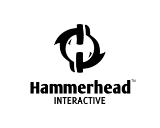
Description:
For a client from Pennsylvania, USA. It's a new website development and interactive marketing company. Mark shows letter H in the negative space formed by two shark shapes.
Status:
Client work
Viewed:
16007
Share:


Lets Discuss
Constructive criticism on this one more then welcome! Thanks!
ReplyHmm, something bothers me about the way the type is arranged with the mark (which I love by the way). I sort of feel like the type should match the H inside the mark as opposed to the hammerhead shape itself.
ReplyThanks a lot Lundeja. The idea was, as many times before, to create a logo that could work separated. Client asked for something that could be applied only as an recognizable mark for some needs and a wordmark for others, so I decided to use the typography style that would match the form of the animal itself...
ReplyRight on, right on. I dig.
Replybeautiful mark, i absolutely love it
ReplyThanks Sean!
Replynice work, love the mark
Replywell done Bro .. :)
ReplyChristopher, Nattie and Shylesh, thanks a lot! :)
ReplyWickered mark bro!
ReplyThanks a lot gangsta! Buck! Buck! :)
ReplyGreat mark - 10/10!**Type is distracting as current serif face. Try sans?
ReplyAs a matter of fact Macbipes, this was something I experimented on with the client and this is the final version (updated). Thanks for looking in!
Replyanother nice effort Alen
ReplyI like this Alen, just wondering why the eyes on the inside and not on the hammerheads? I don't think you need those? I think it would be even stronger IMO.
Reply%5EMike, I think they're fins. Nice, Alen.
ReplyOH! well look at it this way. Since it's an interactive website perhaps they are eyes of a mouse?
Reply%5ELOL! Sharp as ever.
ReplyRich, Mike and Roy, thanks a lot guys! Yep Mike, those are fins, that also serve here as a 'light effect' on the negative H letter :)
ReplyYou nailed it Alen! I think it's fantastic.
ReplyGenius!
ReplyMads and Dalius, thanks a lot fellas! And of course David, for 'gellerizing' it! :)
ReplyGood stuff... what font is that,, MoolBoran?
Replyreally good mark!! but I can't see the fins. I only cacth the two black shark hammers and the two whit mouse
ReplyThanks guys! The smaller fins are detached so they can serve the other purposes as well. :)
Replywow! An other HH logo:)
ReplyI like it!
Replylove it!!
ReplyPedro, Sean and NoLogo, thanks!
ReplyTop stuff as usually :)
ReplyGuess I'm a little late, but hey, great logo!
ReplyOski and Kevin, thanks a lot! :)
ReplyNot a big fan of this one... not quite focused I think.
ReplyHammered on the head....of the nail :)
ReplyGCWB, no probs, all good! :)*DBunk, off the hook baby, off the hook! :) Thanks!
Reply%22http://www.vipinashok.com/%23workLink%22:http://www.vipinashok.com/%23workLink Alen, this individual is stealing your work. Check the logos link.
ReplyI think a shark needs to sink the teeth into him!
ReplyLundeja, thanks a lot for the heads up. I have contacted him and asked to remove all the work he uses for his personal promotion that doesn't belong to him. Funny thing, he wrote at the bottom of the page that copyright belongs to the authors?!*Fabster, thanks for the support mate! :)
ReplyThanks, David.
ReplyThanks a lot David, very professional of you, very nice move, I appreciate it a lot! And of course, I couldn't agree with you more on this one...*Alen
ReplyAlen, this is a great looking logo. I love the smaller fins, they add style to the H.
ReplyThanks, Robert!
ReplyAppreciate David's efforts, Rock Star Admin!
ReplyPlease login/signup to make a comment, registration is easy