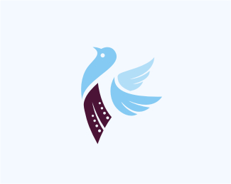
Worq
by Type08 • Uploaded: Jan. 21 '11

Float
(Floaters:
48 )
Description:
Logo for the Brazil based software development company.
Status:
Client work
Viewed:
10697
Share:

Lets Discuss
Outstanding mark and type, Alen! :)
ReplyLooking mighty fine bro!
ReplyLooks good - nice colors.
ReplyAwesome bird man ...
ReplyPerfect!
ReplySo far this is my favorite worQ concept.
ReplyReally digging the type on this one.
ReplyThanks people! After few rounds of adjustments client decided to chose this one as a final solution. Website coming soon!
Reply%5ECongrats mate!
ReplyFar away better! Love it! (i dont know if what i'm saying make sense in english, its a portuguese expression translated. HAHA)
Replylol, that's actually quite funny in english
Replycongrats on this chose, Alen. great work indeed, my friend.
Replystrong elements here allen..congrats...:)
ReplyAhh, great that you've chosen this one as the final concept. Type fits more and the tucan seems even more friendly.
Replygratz Alen. turned out very sweet!
ReplyThank you all, I really appreciate it! Thanks!
ReplyHot baby, hot!
ReplyMuchas gracias, Jose! :)
ReplyJust a thought, Alen. Do not know if the 'Q' has to be bigger than the other letters. Maybe all the same size becomes more subtle.
ReplyThanks a lot, Breno! Everything you see here is a result of the mutual efforts with the client during the adjustment phase - they liked it as 'worQ' (work quality) and not 'WORQ' so we played with that format. It is nice to get a support on this one from someone that actually lives in Brazil, I appreciate it!
ReplyNice concept, lovely mark. I agree with bitencourt, the Q doesn't need to be bigger.
Replythis is great! il love the mark
Replyits really nice..
ReplyNiiiceee Alen%3B great concept mate!
ReplyOoooh, nice, I like this one best, my good man.
ReplyLadies and gents, thank you all!
ReplyTop notch bud.
ReplyThanks M!
ReplyYes, perfect!
ReplyThanks a lot, Nikita!
ReplyPublished in Logo Lounge 7. Also part of a little animal-themed logos set at www.cargocollective.com/type08/Animalogos-1
ReplyThis bird looks better than yours Al.
ReplyHahaaa, that\'s how I treat them buddy!
Replyhermoso, pero la Q mas grande es otro concepto, en fin es el arreglo con el cliente y el cliente siempre tiene razon!
ReplyThanks Analia! Yup, client wanted to be spelled as worQ with the capital Q at the end, thus the Q form of the logo mark as well.
ReplyPlease login/signup to make a comment, registration is easy