Description:
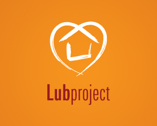
Project that aims to care for and ultimately rehouse the homeless. The sketchy stroke style is inspired by cave paintings, ie, our earliest kind of homes perhaps, decorating, pride in ones own place to live, etc.
Status:
Nothing set
Viewed:
9791
Share:
Lets Discuss
Any comments appreciated....
ReplyI quite like it. At first I thought it looked a little odd because it took me a second to see the house (I'm slow), but once I saw it I think it's quite effective.**Did you take down v1? I wanted to compare but I don't see it anywhere...
ReplyIt was very similar, just on a white bg with normal san serif text and a mixture of associated the colours in the heart. I also changed the heart shape slightly as it was a little long. Its a simple logo for a charity org, they're happy so this version will stand. Cheers for the comment.
ReplyHere's V1. http://logopond.com/gallery/detail/21066. I may use the same colours if the logo needs to go on a white.
ReplyAh, thanks. Yeah I do like the new type better.**I do like how the color scheme on v1 looks, though. Just a personal opinion, I don't have a good reason why. :-)**Good work.
ReplyThis came out nice, Terry. Good work!!
ReplyHi, love to put this on my blog cos I'm collecting all nice designs with heart shapes.*You ok with that? You can see how I have put others up on cluelessclay.com
ReplyNice logo. Very clever idea.
ReplyYep, definitely belongs in the gallery. Great brand, Terry.
ReplyCheers all for the nice comments and for you lovely administrators who put me in the Gallery!*@mei, 'love to put this on my blog cos I'm collecting all nice designs with heart shapes. You ok with that?', No probs, go ahead if you want. It was created in Illustrator, by the way.
ReplyWell done on the front page view once again! Bravo!
ReplyThanks Terry%3B scheduled to go live on 19th Dec on cluelessclay.com and meanwhile if you like to link to your personal site (currently I linked to your logopond's showcase), feel free to let me know.
ReplyHey Ternacious, it's me Mike. I love the creative concept and style in your mark, just not feeling it with the type and the Lub in dark ruins it for my as a whole, but hey thats an opinion and nothing more.
ReplyHi Mike, and HAPPY CHRISTMAS! I take all advice seriously and especially yours. I see what you mean about the type, the client is pretty happy with it is as it is, as it was based on their requests, but I'll see what I can do. Cheers again and Merry Christmas all logoponders out there!
Replyhi this is anand , your logo is simply superb
ReplyGreat Mark :) but type... :(
ReplyCheers :) and I also agree... :(*I was gonna change the type and was waiting on feedback but the job kinda stalled, I was paid (whoopee!) but I think the company came into some budgetary problems so this was never really completed.
ReplyO I did something really similar, like 2 years ago. Never saw this though, and never posted mine online - didn't use it in the end because it felt it bit too much Habitat logo..
ReplyPlease login/signup to make a comment, registration is easy