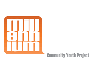
Farronshonnen Community Youth Project
by TernaciousT • Uploaded: Nov. 23 '07

Float
(Floaters:
5 )
Description:
Rough concept for a Youth Project
Status:
Nothing set
Viewed:
3057
Share:
Lets Discuss
I've spent the majority of time so far on the icon. Type is obviously in need of attention, that's the next step!
Replywow...i love the icon. It's really cool. Great work.*I don't really understand what the word %22Farronshoneen%22 means but anyway i don't find much a problem with the typeface also. It looks great to me.
Replyi think this is excellent!
ReplyI like the little F's %3B)
ReplyThx Shinaz, nido %26 firebrand. I took on this project which involves designing logos for about 20 different projects that are part of a larger Youth Organisation, where my dad works. This is just one of many, its not very well paid but sometimes you have to do a few favours! You can see more of them in my showcase.
ReplyI love the mark, good work!
ReplyPlease login/signup to make a comment, registration is easy