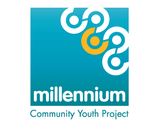
Millennium Youth Project 2
by TernaciousT • Uploaded: Oct. 12 '07

Float
(Floaters:
0 )
Description:
Concept 2 for Youth Project Logo
Status:
Nothing set
Viewed:
2366
Share:


Lets Discuss
Very nice concept, though a few things bug me, the grey text should definately be under the bubble, and the lettering in the bubble, especially the %22Mill%22 looks like it's been stretched a little because of the longer letters (ie%3B the m should be the same height as the n's). The colour is nice and vivid though%3B definately eye catching.
ReplyPlease login/signup to make a comment, registration is easy