Float
(Floaters:
24 )
Description:
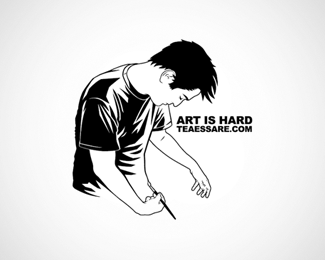
Teaessare Illustration & Design logo.
Status:
Nothing set
Viewed:
11298
Share:



Lets Discuss
Clever idea.
Replycool!!!
Replynice illustration.. but i thought the dude was injecting himself.. art is easier when your high!
ReplyThanks for ruining it for everybody nido! All I see now is the artist giving himself an insulin shot! But you can ignore us Teaessare, we think its pretty darn clever mate.
Replycool, i love it
ReplyGreat illustration work, I love it - but seriously, how does this even come close to being a logo? It's an illustration for crying out loud! And so are a lot of other logos in this gallery too.** If I want to get into the 'lp' gallery, I'll be sure to whip up an illustration next time.
ReplyThe anatomy on this one could use a lot of work, is that intentional to show how %22hard%22 it is?
Replyfrom the thumbnail i thought the guy was having a little %22one-on-one%22 time, lol.
Reply%5E LOL!
ReplyNot a logo, an illustration, but I like the idea.**
ReplyGood concept and illustration!
ReplyI agree, Picasso %26 most of Dali's work wasn't anatomically correct, does that make it any less masterful?**It is a logo, it's an 'illustrative' logo...
ReplyClimaxDesigns, I invite you to read the entire sentence.
ReplyIt's a good concept, but it does look at first like he's either masturbating or injecting... (n_n)**in a more technical frame of mind, maybe the line quality could vary a bit? Like remove parts of the line to show highlights, thicken it up to show shadows etc... it's a bit static at the moment.
Replydache said:**It sure was quiet when you were on %22holiday%22 as you say. (sarcastic) Welcome back. %3B)
Reply@ClimaxDesigns**%22and what makes this 'not a logo' if he uses this as his signature brand than it is so a 'logo'.%22**That is debatable. So if I take a photo or a painting and slap that on my business card it is a logo simply because I am using it like one?*
Reply@Harry**I did...**http://logopond.com/gallery/detail/17476**If it's debatable like you say, than how about you just accept that somebody has a different opinion than you.
ReplyHaha.**Well, is this illustration a symbol? If you think its a symbol, you need your eyes checked. My dictionary defines a symbol as a shape or sign used to represent something such as an organization. **This is an illustration, it is not a symbol. It is not a shape, it is not a sign. It is practically a realistic picture of a person. No doubt taken into illustrator and live-traced.
Reply4. A logo (in any sense of the word) is nothing more than an 'Applied' Illustration.
ReplyDid you even read my post? The dictionary says that a symbol is a shape or sign used to represent something. **You are using the wrong definition. If you look further you will notice an example of that kind of symbol which says %22the limousine was a SYMBOL of his wealth and power%22. That is certainly not the right symbol we are talking about here.**I think a logo is a symbol that represents something, like you said. And a symbol is a shape or sign, in other words, something a bit abstract, not entirely realistic like an illustration. It is a mark, not a picture. Not a painting, not a photograph.*
ReplyWhat a useless argument. It is an illustrative logo. There are thousands of them out there, hell there are even photographic logos. The definition is wrong. Get over it.**Teaessare, you do good work.
Reply%22lets just agree to disagree on this.%22**Agreed. **Good take on the whole thing too. I can understand where you're coming from about artistic freedom. **Apologies if I have offended anyone.***
ReplyHAHAHAAAAA... i cant believe people are using dictionary definitions to describe what is %26 is not a logo!... shall we do the same with art?... what is art?.. look it up lol!.. now thousands maybe millions wont need to study design/art at colleges/schools, we have no need for any ones advice on what a logo is or is not... the dictionary has settled it once %26 for all!...**really people...
ReplyI think the point is the relative sizes of the illustration/symbol/icon/design/logotype %26 the name of the company, product etc. Clash, the text is more visible in your three examples than it is in the Art is Hard logo. That is an important difference - the smaller the type, the closer to an 'illustration' with a caption, almost.
Replynot that it matters, but I think the COULD be used as a logo. That doesn't make it a good logo. that's what I think anyway. some people may love this, and I'm ok with that, but I say %22sinker%22.
Replyhttp://en.wikipedia.org/wiki/Logo**%22not use the face of a (living) person%22**who makes this sh** up?
Reply@ raja : LOL!!**I like this one. http://en.wikipedia.org/wiki/Logo**%22avoid being excess in attempting uniqueness%22**Huh?**
Reply@Clashmore**Mate, aren't you over this yet?**I've made it clear what I think is an illustration and what is a logo. But why don't we do something different and broaden the view out a bit. Lets talk about the real world.**Think about McDonalds, FedEx, Nike, Apple, Adobe, the list goes on. Have a look at their logos. They aren't illustrations, they're symbols that represent something. Lets take a look at Apple. Their logo is a simple symbol that people recognise, it is easy to read and remember. And this is why they are selling products. Would Apple be as successful if its logo was say, a photograph? No way.
ReplyI definitely think there is a place for the illustrative logo and there are quite a few talented designers who create them. The works of Von Glitschka, Paul Howalt, Tracy Sabin, Michael Schwab and Felix Sockwell to name a few. Much of their work could be labeled as %22illustration%22, but these works are also considered logo design. They work with some of the Fortune 500 clients mentioned above and some much smaller. There is a place for it no matter how you want to define it.
ReplyGuys just drop it, pretty please :_)*
ReplyFor the sake of everyone's mental stability, I'm going to stop this here. We could go on and on, so I'm willing to accept that we have different ideas about what a logo is and is not.**Now lets move on.***
ReplyHey guys, what's goin' on? Looks like a party... wait... whoa. I don't like the vibe in here at all.**_italics_Ok, keep head down, get a couple of pulls off the keg, back out of the room slowly.
ReplyCool! Idea from the art of Escher?(Drawing Hands)**
ReplyVery nice, but a little complicated, no?
ReplyI think the typography is terrible, and this is so not a logo in my opinion.
Replyfpm is crazy ... this is an EXCELLENT logo .. very clever. I would change the font to make it a little more readable. Otherwise, i love it!
ReplyPlease login/signup to make a comment, registration is easy