Float
(Floaters:
21 )
Description:
Logo for band, Spider & Fly.
Status:
Nothing set
Viewed:
6711
Share:


Lets Discuss
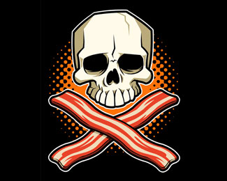
what is the meaning of the graphic. It does not contain neither the spider nor the fly.
ReplyI love this. The font choice is very fitting as the overall feel of the graphic is art nouveau. :)
ReplyI do not think it needs a spider or a fly. I love it.*Has eight tentacles... there is your spider reference reddskin :o)**Has a Rio de Janeiro%EDs carnival / Art Nouveau feel.
ReplyYeah, this is really cool.
ReplyFantastic logo, one of the best.
ReplyIs this logo for sale? beingbeadle@gmail.com
ReplyPlease login/signup to make a comment, registration is easy