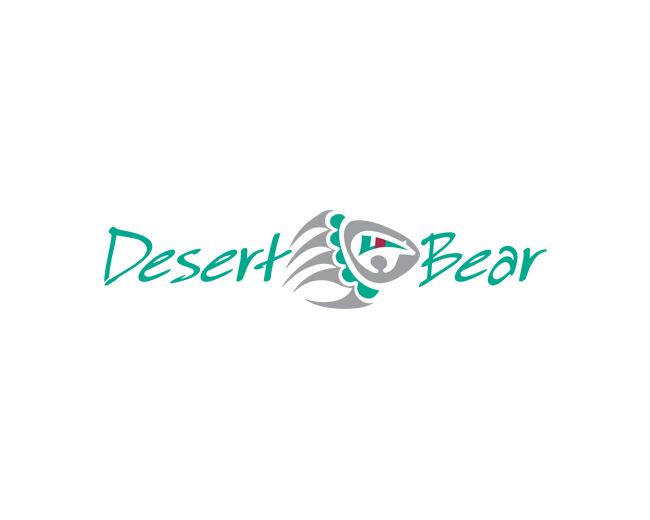
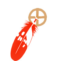
Desert Bear
by THEArtistT • Uploaded: Sep. 26 '08

Float
(Floaters:
12 )
Description:
The Desert Bear name and bear claw illustration were done for a real client to name a proposed SW property development located in Arizona. The illustration is directly inspired by local jewelry Native jewelry makers. The project was a no go. Which is honestly for the best. I would much prefer this logo to be acquired by a SW indigenous owned company or individual.
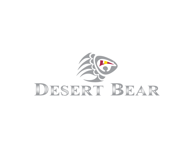
The original logo design is the one in silver (see alternates) with a font that shows diamond cutting. It is a technique used in jewelry making to give silver a faceted look.
Status:
For sale
Viewed:
4,670
Tags:
inlay
•
art
•
jewelry
•
indigenous
Share:
Lets Discuss
Too much Bear. Great idea though. Simplify the font and mark.
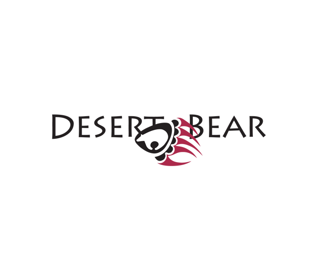
ReplyBut it is all about the bear. The mark is based completely on traditional Hopi silver work that is often inlaid with coral, turquoise, onyx and other semi precious stones. Originally designed purely black and white (because the desert bear in Hopi folklore is white), but it was too stark so I added the color inlays. The font I chose because it looks like diamond cut silver in the modern style. I know the current trend is to use very simple fonts, but this font felt right for the Southwest area and the Native American art I was using for inspiration.
ReplyTrue.
ReplyThank you, by the way.
ReplyNo problem.
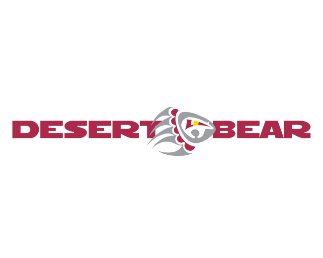
Replyrevisited this design with new layout and font. comments?
ReplyIs this Real, as in %22made for a real client%22, or Fake, as in %22done for fun%22. I need you guys to help me. The name, concept and illustration of the bear claw were done for a real client. The job was a no go however. I have since worked on the font and color in an attempt to sell the logo. So is it Real or Fake?
Replypoint taken
ReplyThe diamond cut on the letters should be simplified maybe? Instead of 2 vertical cuts just 1? So the middle part of the letters' body doesn't %22dissapear%22 into the background. The mark screams Hopi art already, so I think the font could be a little bit ethnic (for lack of a better word). Cool mark!
ReplyThanks GreenInk. I've updated the font. People by and large didn't care for it. Does it pass muster now?
ReplyHey Trish, I like the font, but i think you need to increase the size of the font, the mark is overwhelming the type. I like this layout more than your original :)
ReplyThanks, will do.
ReplyAnd Thanks Jerron! for the float.
ReplyOk, bigger text. I'm thinking this is IT.
Reply%5E Go on I'm sure you can leave a comment here too.
Reply@li-on design %3E%3E You'd better go and find it, then. Worthless comment ftl.
ReplyHe said there is too much black. I personally like using a silver hue for the black, but I haven't gotten favorable comments on that either. Yes, I could change the background color, but if the logo doesn't work on white, it is not an improvement if it works on another color. Can't please everyone all the time! I love all the critiques and comments, absolutely, but sometimes trying to please everyone on such a public forum is like designing by committee. And we all know what can happen then!**Thanks for the float Jared!
ReplyThank you for the float Rudy!
ReplyThank you for the floats, Milos and MikeyMike. :)
ReplySorry I missed this. Thank you for the float Lady Gray. :)
ReplyGreat :) Love the bear inside.**Though I'd make claws more careful/smaller.
ReplyThank you. :) Glad you like it. **The mark realistically represents very specific southwest style Ndn silver jewelry (and bear claws are ridiculously long in the first place). I wouldn't shorten the claws because then it would not be faithful to the indigenous art. But thanks again for your nice comment.
ReplyPlease login/signup to make a comment, registration is easy