Float
(Floaters:
2 )
Description:
Intellectual Property Lawyer identity visual
Status:
Nothing set
Viewed:
3292
Share:


Lets Discuss
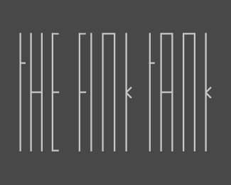
The mark itself is too complicated, there are way too many red dots and way too many lines. The text isn't centered with the mark, and I feel the mark and text aren't proportioned correctly.
ReplyMD I thought it would be too obvious centred so lined it with the L for interest. VC Glad you spotted the dot at the end I love adding touches like that.
ReplyTC, MD,*To be honest I like the way that this breaks convention of what people think a logo should be. It has a delicacy that wouldn't traditionally fly with a logo. The old days of worrying about faxability etc. are (almost) gone and irrelevant now. Logos these days can be more intricate then in the past - most are only ever offset printed at high quality on stationary or promo materials or displayed on the web.*I say well done for breaking convention with a logo that you just want to look at.
ReplyPlease login/signup to make a comment, registration is easy