Float
(Floaters:
0 )
Description:
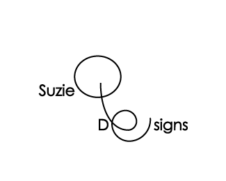
This is my nickname, the tail from the "Q" creates the "e" in design, i love it!
Status:
Student work
Viewed:
1179
Share:


Lets Discuss
SuzieQoo*It's still really hard to read, However I really like the concept of the lowercase %22e%22. If you are going to use a sans-serif font you need to make your stylized %22Q%22 and %22e%22 more of a logo as opposed to part of the logotype itself. Also your stroke wt. on the %22Q,e%22 is not big enough. Think about what we talked about and what you learned in class with the plotter. Keep these in mind as you design all your other logos in this class.*
ReplyThe %22Q%22 has the right feel but the %22e%22 doesn't seem to have the right flow. I would drop the %22e%22 and play with the movement of the %22design%22 a bit closer to the %22Q%22. Maybe give the %22Q%22 some color to stand out from the rest.
ReplyPlease login/signup to make a comment, registration is easy