Description:
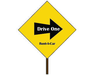
If all else fails, this should persuade you to rent from rent-a-car for long distance traveling! Drive one!!
Status:
Student work
Viewed:
1095
Share:


Lets Discuss
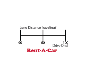
I don't really know if this works as a logo. the Milage meter/chart thing doesn't really fit. Another thing...what does long distance driving has to do with the logo? If drive one is the company you're designing this for, you need to put more emphasis on the company name.
ReplyOnce again I would like to refer to the rules of logo design. Rule Number 37. Do not use taglines in the logo. I also think the the whole timeline thing doesn't work as a logo, first of all it has too much detail. What does work about this logo is the %22Rent a Car%22. It works because its readable clear and simple, so much so that it even overruns the name of the company (Drive One).
ReplyPlease login/signup to make a comment, registration is easy