Description:
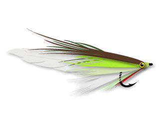
This is a logo i designed for my buddies fishing boat. As he put it "the logo turned out sick!"
As seen on:
Manifest Creative
Status:
Nothing set
Viewed:
3699
Share:


Lets Discuss
my grandfather tied his own and I had a gallon can full of them. someone stole them. :( this fly is fly man! very sweet execution!
ReplyEveryone has a favorite logo on Logopond, and this one is mine. I just LOVE this logo. :)
ReplyThere's a difference between a favourite logo and one that deserves a gallery spot. Assuming you put this there. But even if you didn't, I don't think it is worthy. Nothing personal to SuperDave or his buddy.
Reply^ I feel about the same.
ReplyHow this got featured?
Reply?
Replyok, so I am out voted. but why is it not worthy? how does it not measure up to, well, anything else already in the gallery this month?
Reply^ I think it's probably up to you to justify why it IS worthy. In my opinion, the "mark" is less of a symbolic/memorable/distinctive logomark and more of a literal vector drawing of a fly. And I see "lettering" is listed as a tag, but the two a's and i's are clearly the same, which makes me think it's not lettering... (Plus, there's a drop shadow on everything)
Replyisn't all design subjective ?
ReplyI agree with everyone else. Compared to the types of logos that get gallerized here, this one isn't even in the same league.
Reply"isn't all design subjective ?"
ReplyKaimere, Yes. But, the gallery is subject to popular opinion as well as a general (if unspoken) consensus that a particular design is deemed worthy. This to me is neither good nor bad, SuperDave's buddy thought it was "sick" and so then SuperDave did a super job and may they, both of them, as well as their children's children, live honourable and prosperous lives. My view, however, remains, that a "favourite" logo makes not a worthy gallery logo necessarily and a worthy gallery logo is made only so by the majority who view it and express upon it. In this case, regardless of good or bad, the mob has spoken. I wouldn't dream of telling anyone to dislike it.
"isn't all design subjective?"
ReplyNo, that's why it's design. There's a problem/solution involved, as well as an audience that needs the right message communicated to them in the right way. That being said, opinions can differ, so I'd say design is both subjective and objective. By contrast, fine art is subjective.
To be honest i wasn't gonna get into the semantics - even though it had a question mark it really wasn't a question.
Reply@ Samdemastrie - you confused me - Design is subjective otherwise your client would have no say.
@ Nido Is the gallery subject to popular opinion ? and if its an unspoken consensus who heard it ? because if it made the gallery then obviously it passed the criteria ... unless it didnt but wait it did.
Personally what the client thought or the designer or the dog doesn't matter, that was the designers description. The fact it made the gallery is.
If mob rules rule ... nice ... kinda bully tactics to me - its not the logo its the principle !
I agree with you both in a way. Art IS in the eye of the beholder, But with 2k views and only 2 likes, kind of speaks volumes.
ReplyOh you didn't want to get into semantics... should've said. Damn words on the internet.
ReplyBar fight then? Mike would be in, right?
;) well i didn't want to say it was a rhetorical question.
ReplyIll stop being cryptic - regardless of views, likes blah blah blah, mob rules etc etc. This is a "designer" and i just feel you lot have singled him out and deemed not worthy because he doesnt fulfill your criteria.
Going by what was said prior obviously the "process" is wrong.
Haven't been on the site for some time but seems a lot has changed and stayed the same :)
Wheres the bar ?
Mike. It's kind of like Giving every kid a Trophy In school and sports win or lose , so we don't hurt their feelings and make everything equal.This is why our society is not building stronger a generation, you have to earn what you get in life IMO. I try to be nice to all people and give constructive comments.
ReplyAny Bar anytime Nav :) Love ya all.
I've had some of the same comments said to me and Logo got taken out of Gallery. Makes me try harder.
ReplyMike - ummm ohhhh k lol not to sure on any of that ...
ReplyI do feel bad we flooded the designers post though.
ReplyWell Climax seems that no one reads here - i haven't mentioned anything re: the logo or have i expressed my view throughout the whole thread. As stated before the contention has been the process - what we call Indian Giving but it seems Mike has assured me that this has happened to him many times so i guess its the done thing.
ReplyAnyway as you were
If you feel i'd add value feel free to make me a mod.
ReplyPlease login/signup to make a comment, registration is easy