Float
(Floaters:
1 )
Description:
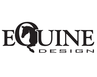
This is the logo I plan on using for custom horse illustrations that I produce.
Status:
Nothing set
Viewed:
2466
Share:


Lets Discuss
The Q text part is too big and the font for DESIGN doesn't work with the feel of EQUINE. I love where this is going though.
ReplyPlease login/signup to make a comment, registration is easy