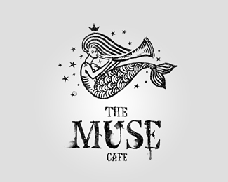
Float
(Floaters:
137 )
Description:
Identity for jaz-bar-cafe.
Status:
Client work
Viewed:
14015
Share:





Lets Discuss
great style to this. nice illustration.
ReplyThx u Mike*)
ReplyYes very nice illustration. I have problems with the illustration being line art and the typo being more of an ink wash though. They don't quite fit IMO.
ReplyNice illustration style.
ReplyHello friends, u can c moore here http://revision.ru/work/27215/**)))
Replydig the illy
ReplySweet work.
ReplyVery solid work, indeed.
Replyvery nice work... whole project i like:)
ReplyWell ok, on that larger sample I can see some of the wash effect on the illy. Works together better for me. Quite nice.
Replyadorable illustration. you have a great talent mate!
Replygreat again ! i love your work %3B)
ReplyBeautiful illustration!!
ReplyI think she has a fat neck : )*Wonderful illy!
Replylove the style!
ReplyThis is great!
ReplyBeauty! Block cut - nice treatment
Replythis is great, love it
Replykrutota!
Replywow, cool illu !
Replylovely!
Replyi don't think i could love this anymore!
Replythis is beautiful!
Replykirill, thanks for mentioning the other site that shows more usage.*love it even more now. real nice.
Replya bashev pravilno pro podteki govoril ,)
Reply%5E%5Ewell said Mike....the coffee cups look great!
ReplyOne of these days you'll let me down...one of these days. Very nice.
ReplyRemarkable. Great work!
ReplyLoving the style on this guy!
ReplyLove the illustration, type just doesn't help it though.
ReplyGreat illustration skills and the design is wonderful. I would certainly go there for the identity alone. Nice work.
ReplyThank you friends, for ur comments:)
ReplyUltra Cool
ReplyNice illo... but isn't that basically the Starbuck's mermaid?
Replyvery nice illustration!
ReplyI love the ink-splotched type, it's got a very poetic/artistic feel to it which is perfect for the clientele of a cafe.**The illustration is beautiful with that origami concentric-circle pattern in the tail.
ReplyWow. Nice job!
ReplyKeep coming back to this, beautiful work!
ReplyI love the illustration.
ReplyReally digging this logo - especially the type. Nice work.
ReplyGreat presentation!
Replycant stop admiring this
Reply%5EWhat he said. Love everything about this one. Great work.
Replycongrats on the feature...i think this remains my favorite from your showcase...
Replyvery very nice :o)
ReplyI really like the logo of the woman holding the %3Ca rel%3D%22dofollow%22 href%3D%22http://www.caldwells.com/products/doors-by-type/sliding-doors/%22%3Esliding doors%3C/a%3E trumpet but it kind of remind of Starbucks logo.
ReplyGreat graphics, illustrative style is impressive!
Replybest of the best. my favorite logo.
ReplyGood job, I have been looking for this logo for a long time! https://routerlogin.pro
ReplyI like this style, the logo is cool.
Replyhttps://routerlogin.pro
Good job and good style. I like your logo, well done!
Replyhttps://routerlogin.pro
Excellent information! Very helpful post thanks for the info
Replyhttps://mywifiiextnet.com/
Please login/signup to make a comment, registration is easy