Description:
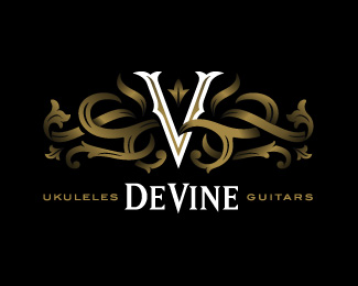
My first project won through LogoPond! :-) Logo for Eric DeVine, maker of high quality stringed instruments. The brief called for a literal vine, to play off his surname. Also needed to show a long heritage, craftsmanship and French flair (his surname is of French origin). Another requirement was for the overall shape to fit the headstock of a guitar. Colour prints gold.
As seen on:
DeVine Guitars
Status:
Client work
Viewed:
17539
Share:

Lets Discuss
Very nice, Simon!
ReplyMuch appreciated! :-)
ReplyVery nice and appropriate.
ReplyThanks Stelian! :-)
ReplyCool, Simon! )
ReplyCool, Simon! %3D)
Replyreally good!!
ReplyThanks cerise!
Replyexquisite piece of work,Simon!
ReplyThank you! :-)
ReplyGreat work Simon! :)
ReplyThanks vernics.
Replybrilliant work !
ReplyHi Bernd. Thank you buddy!
ReplySo cool...Nice job!
ReplyBeautiful!
ReplyThanks Rokis %26 Nikita. I really appreciate the comments. :-D
ReplyVery great work! I would love to play an instrument with that mark on it!
ReplyNice job!
ReplyThanks lumavine %26 steve! :-)
ReplyI did a mock-up of the guitar headstock and it was looking sweet. Also have worked on the inside 'label' (signed by the maker) and 2 funky t-shirt designs.
ReplyREALLY SWEET, SIMON.
ReplyThanks Mike! :-)
Replycongrats
ReplyBeauty!1
ReplyVery elegant - I would imagine a product stamped with this to be of really good quality!
ReplyThanks Colin, Mike %26 Daniel. I can't wait to see the final products too!
ReplySpeechless:) Logo looks great, their website is excellent and those instruments they make are splendid. I'm in love:)
Reply%5E Thanks Roko. And for taking the time to visit the client's newly designed website. The photography is awesome, and all his own work! Amazing craftsmanship on his guitars and ukuleles, so it was initially quite intimidating to design a logo to represent that level of skill. I mean, come on, it's an unfair battle - he has cool woodworking tools, and I have a pencil and mouse. %3B-)
ReplyVery, very nice, Simon!
ReplyI guess it's not how big your tool is but how you use it :) Congratulations on the feature too, really well deserved!
ReplyLOL shit it's 13mu featured - my bad! Haha take it as a compliment though - your portfolio is great man
Replysplendid outcome simon. really happy he went this option... you've done a stellar job (again)!
ReplyGreat job Simon!!
ReplyVery kind of you Sean, Daniel, Matt %26 Alan! Daniel, LOL at your 'tool' comment! :-D
Reply@Simon*I completely understand what you're saying:) But again, I don't think he would be so comfortable and good with mouse and pencil as you are:) *Living in Hawaii, crafting beautiful instruments, enjoying music, what a lifestyle, marvelous!
ReplyTop dollar. Well dome Simon.
ReplyThanks Gareth %26 Sergey!
ReplyNice work on this one. I really like the sense of depth.
Reply%5E Thanks Jeff! Pity I'm such a shallow guy. %3B-)
ReplyThanks for all the nice comments on my work, Simon. I enjoy your work too! It seems like you're really enjoying working within a circle in your recent logos, which is really cool, and not easy to do! I would love to see how this one works in one color. Also, I can totally see this working on the headstock, with the V and Devine in pearl, and all the viney stuff in a lighter tone of wood! Gorgeous (and expensive) guitars too!
Replyyeah! It's perfect!*Especially if it is connected with guitars*I all hands have already broken that:)*
Replynice work!
ReplyI like it.
ReplyPure magic! So good...
ReplyThanks Nathan, Sergey, Codeluu, m %26 Christian! :-)
ReplyYour work is amazing Simon. Keep it up
ReplyThanks man. Will try. :-)
ReplyNice job mate :)
ReplyJust wanted to give a big thanks to Simon for his work on my new logo. Simon really is a great guy to work with and knew what I wanted better than I did. Thanks Simon!
Reply%5E Hi Eric. This took me completely by surprise. Thank you so much for signing up and commenting here. While what we do is categorized as 'commercial art', I believe we as designers form strong personal attachments to the work we produce, having immersed ourselves in your world for a while, so I'm extremely grateful to be acknowledged beyond a pay cheque. Thank you!
Reply%5E LIKE!
Replyguiters...one more - PERFECT!!!
Replyguitars...one more - PERFECT!!!
Replyvery nice....are you always going to keep the dark background?
ReplyStylish!
ReplyThanks LP'ers.
ReplyWow! Somehow I had not seen this before. Incredible work simon!
Reply%5E Thanks levelb. Much appreciated.
ReplyAlways loved this ... but never floated ... shame on me !!
ReplyLogo from LN02 book and it is always pleasure to open that page. I think that it's primarily a client and his business was the main inspiring factor here.
ReplyPlease login/signup to make a comment, registration is easy