Description:
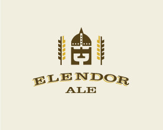
Just spontaneous fun created a while back that some of you may have already seen. Was working with a Clarendon E, turned it on it's side and noticed the chalice/goblet in the negative, abandoned my paying project, thunk up a name and here is where I ended up.
As seen on:
Sean Heisler
Status:
Just for fun
Viewed:
6838
Share:




Lets Discuss
Nice job Sean!
ReplyYeah this looks nice.
ReplyI'm a big fan of this.
ReplySergey, Richard and Stelian, thanks, guys!
ReplyLove the balance here, nice one Sean!
ReplyThanks, Alen!
ReplyUpdate/experiment. Someone mentioned that the turned E looked like a Norse/Scandanavian armour style helmet, which I saw too, and wanted to see if there is something there. You can still see the goblet/chalice in the negative space. Is this working at all? Made me think of Thomas' Mikos logo though, certainly don't want to have this an issue, I will change it back to the way it was.
Replynice helmet )
ReplySolid Sean, digging.
ReplyI like it!
Replynice addition. like it, Sean.
ReplyCongrats Sean!
Replylike :)
ReplyGreat !
ReplyWhoa, crazy! I guess the transition to the helmet works. Thanks so much, you guys!
ReplyStill like it .
Reply%5E Good to know, Pierro, thanks!
ReplyThis is clever Sean.
ReplyGOOD!!!
ReplyNice Sean :)
Replyturned out pretty good...
Replynice work, concept seems similar to one of my pieces :)
ReplyReally like the concept! Seems like some of the whitespace could be removed to tighten up the overall concept?
ReplyThanks all you gents, really appreciate it!**@ Fred - I agree, nice suggestion! I moved the wheat in and then reduced some of the tracking in the type, looks more solid now, thanks!
ReplyReally like the looks of that!*
ReplyI think that really tightened it up, thanks again for your suggestion! By the way, I know this concept is a bit %22goofy%22 but, hey, it's just for fun!
Replybrilliant crest like design ...
ReplyThanks again, my good man!
ReplyVery interesting style and graphical realization of conception!
ReplyPlease login/signup to make a comment, registration is easy