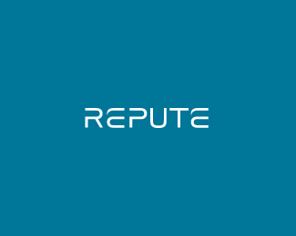
Repute
by SeanHeisler • Uploaded: Apr. 18 '10

Float
(Floaters:
28 )
Description:
WIP wordmark. Repute is an umbrella company in India operating a number of diverse companies from bottled water to office supplies, logistics to food and retail.
As seen on:
Sean Heisler
Status:
Unused proposal
Viewed:
2660
Share:


Lets Discuss
I like the overall feel of it Sean, just I think I would cut that little piece from p, which is going to the left. What do you think?
ReplyThanks, Miloz! I was wondering if someone might bring that little guy up. :) My thought here was that little organic shape is the shape that is kind of the oddball piece in this that draws the eye. Does that make sense? Something that kind of throws is a little bit. Maybe I should throw up a V2 without it??
ReplyHeheh, No probs buddy! I see what you mean, but hmm maybe it would look better somewhere else? Because there it makes some thightness with all those shapes. What about making this little organic thing on the left side of R?
ReplyI went ahead and removed it. I may try that on the other side of the R and some other things. WIP I guess. Do you like this better? Thanks for your help!
ReplyYeh try it. It looks better for me now!
ReplyLooks sweet Sean! Maybe the crossbar on the T is too thick though...seems like my eye keeps wandering there. Not sure if a thin line connecting the P and U would make it flow better either. Like where it's going though :)
ReplyUpdated. Thanks, guys! Appreciate the comments, Joe, I updated the mark with a slimmer crossbar over the t and then made that connection between the p and u. I like it. Better?
ReplyYes sir, looks great. Seems like the first e needs to come down a little. That's just me being picky, but maybe me eye is wrong (wouldn't be the first time). Cheers Sean!
Reply%5E Hmm, interesting. The e's are identical and on the same baseline. Thanks!
ReplyYeah looks a lot better without that cluster under the %22e%22.
Reply%5E Ha, cluster! Glad you like it, I appreciate the support.
ReplyLooking good Sean! I'm with Joe about the first E, does seem taller than the P...not sure if it's because of the notch at the top of P or if it's the height of the E's crossbar in relation to the P's counter (phew) I think the 2nd E works well with the T. :)
ReplyUpdated. Thanks, Josh! You guys we're right! I pulled a guide and that damn e was taller than the other characters. I scaled it and re-kearned, I think it's looking pretty tight now. Thanks, guys.
ReplyBeauty!! Love it!!
ReplyThanks a lot, Alan!
ReplyNice one, Sean, me likes! :)
ReplyThanks, Alen!
Replylooks good man, nice work :)
ReplyOh, sorry, this is a modified (heavily modified in many areas) font called Cutiful.
Replylooks great indeed. real tight.
ReplyThanks for the comment, Tony, glad you like it.
ReplyOh, thanks to you too, Mikey, sorry!
ReplyThe font I used at the start was Cutiful. The R is completely redone and most of the other characters have been tweaked. Thanks for the float, bro!
ReplyLove the flow...Nice one Sean.
ReplyThanks, man!
Replynice typo....very well:)
ReplyPlease login/signup to make a comment, registration is easy