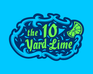
10 Yard Lime
by SamStephen • Uploaded: Jul. 08 '13

Float
(Floaters:
3 )
Description:
Academic Work, Fictional business.
Design Brief: Business is a downtown sports bar known for it's lime infused beer and large televisions. Target audience is men, ages 21-40.
Status:
Student work
Viewed:
4650
Tags:
mark
•
combination
•
typeface
•
Kabel
Share:

Lets Discuss
I'm looking for critique so if you have any suggestions please let me know! Thanks :)
ReplyInteresting look. Initially I had a little bit of difficulty because the lime shapes below the type almost looked like letterforms. I would recommend simplifying that area to match the aesthetic of the football shape above the type so it's easier to read. Also, the drippiness, I would probably contain that to the lime area or the type, not both. Probably keep it off the type so it's easier to read.
ReplyThanks @samdemastrie
ReplyI agree with all of what you said... I'm gonna try and simplify the lime and work on the drippiness!
Please login/signup to make a comment, registration is easy