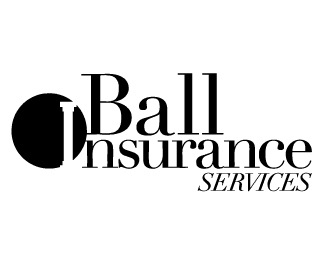
Description:
A logo I designed for an Insurance Company almost a year ago. They still love it but I feel like there is some work that could be done to this logo
Status:
Client work
Viewed:
2073
Share:

Lets Discuss
yeah the owner's last name is Ball, actually. I agree with you completely about the lack of contrast and visual hierarchy. The biggest problem I have with this combination mark is that the logo mark cannot stand alone.**But like I said, they love it still. I just feel like I should update it.
ReplyPlease login/signup to make a comment, registration is easy