Description:
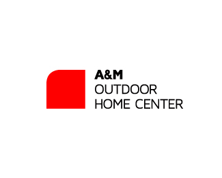
A&M Outdoor Home Center is a small, local shop that sells and repairs lawnmowers, snowblowers, chainsaws, and other tools and equipment for maintaining the home and yard. They're friends of mine and currently don't have a logo, so I'm trying to help them out.
As seen on:
Behance
Status:
Work in progress
Viewed:
7042
Share:




Lets Discuss
UPDATED
ReplyWhy did you choose to go with that particular shape for the icon? I don't currently associate it with equipment, repairs, or homes.
ReplyThe shape itself is mostly abstract and doesn't physically symbolize anything (although it is loosely related to lawnmower bodies, etc.). Instead, I wanted to create a minimalist logo that felt right for the industry, and I think this one does. A large majority of the tools and equipment that they sell and service (and therefore populate the store) are red and black. The main brands that they work with, such as Snapper and Toro, use similar color and form. I went through several different ideas, but something simple like this felt the best. There is good potential for branding as well. Thanks for your comment.
ReplyThanks Joe. :)
Replycool reduced remarkable logo !
Replythat red is very very red. I'd darken that sucker up just a little bit to make it a little more 'earthy'. Typog: Could you take the A%26M as it is and knock it out of the middle of the square? Then there's a few more options for what you could do with the rest of the type, as right now the Name and secondary text aren't given hierarchical balance.
ReplyThanks, Nathan. I think the hierarchy is fine now, but I'm going to try that just because I'm curious.
ReplyNathan, as for the red color, all the machines in this shop that are red (which is a lot) are a bright, pure red. I was trying to match that, but I'll give your suggestion a go. Thanks.
Replyyou're the boss! as far as hierarchy, i read Outdoor Home Center first every single time. If that's the goal then i'll take it back! And actually, i always forget to switch monitors when lookin at colors. I have my left monitor set up for print and the right one for digital, and just out of convenience i usually keep my web browser open on the left, so it screws with the colors a little bit. Drug it over and Hey Presto that red looks great!! haha
ReplyI love the look of this. Well played...
ReplyThanks guys. Nathan, as far as hierarchy, my goal was 1. red square, then 2. A%26M -%3E OUTDOOR HOME CENTER. That way the branding could work at a glance or from a distance.
ReplyIt is very nice, but the mark should really be a hair bigger. The text appears to be sticking out above and below it (I know it technically doesn't).
Replygotcha. i really think A%26M needs more real estate over outdoor home center, but that's just my (admittedly tired) eyes, and there's every chance that I'm wrong. That's what the pond's for, i suppose! Best of luck, friend! **On a completely different note and because i feel like venting, I had a good one today, actually. Did a logo for a client, and sent him an example of the logo in use (this particular one was set so it looked like it was stuck in some wet mud). Sent the client the final logo files and he's like, %22did you send me the wrong file? i thought it was in mud%22. I went on to explain how logos are the simplest shape that can be used in different ways creatively. Showed him a bunch of Nike images where they had made the swoosh out of a bunch of different things - sweat, ice, dirt, etc. He responds by telling me that all those nike images are DIFFERENT LOGOS and that he wanted his logo to be in mud. The joys of working with clients, huh?
Reply@epsilon: I hear what your saying. I'll give it a try, thanks.**@nathan: Thanks for your thoughts, plus that great story!
ReplyPlease login/signup to make a comment, registration is easy