Description:
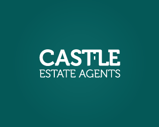
'Castle' with hidden symbolism
Status:
Work in progress
Viewed:
3897
Tags:
symbolism
•
hidden
•
Typography
•
Clean
Share:

Lets Discuss
Nice one!
ReplyYes agree. Really liking this one. I would try a different sans serif type for 'Estate Agent' though. Otherwise top notch.
ReplyThanks very much I'll give it a go!
Replyagree with others. congrats, good job
ReplyThanks qyper your comment is appreciated!
ReplyWhat's the hidden symbolism? I don't see it..
ReplyThe negative space castle shape I'm assuming. :P
Replywhat tabithakristen said! xD
ReplyI see it now. :P It's very very subtle.
ReplyI agree! I think once you spot it though it is annoyingly obvious haha!
ReplyI like it, but I agree with chanpion, changing the font with a smoother one will make the negative symbol pop out more.
ReplyThanks LogoLagoon! I do agree with you both now I have amended it. Thanks for your critique! :)
ReplyPlease login/signup to make a comment, registration is easy