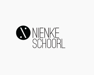
Karin Stolk
by S.vanElderen • Uploaded: Jan. 18 '10 - Gallerized: Feb. '10

Float
(Floaters:
29 )
Description:
Proposal 01 on a new project for me: from a friend for a friend, and back. Karin is a grafic designer that will graduate this year and I did this logo for her as friend. Now she will return the favour.
As seen on:
karinstolk.nl
Status:
Client work
Viewed:
11063
Share:

Lets Discuss
very nice vanElderen... clean and stylish... (friend is spelt with an i before the e... dont mean to be condescending.. just being helpful... hope thats cool)...
ReplyLol, thanks nido... I must admit my English is a bit poor, so thanks for helping my out there! I'm so extatic on my first gallery entry. I hope there will be alot more to come.
ReplyGreat looking mark. Colors are solid, and I like the line work.
Replyit's %22helping *me* out there%22... nah im kiddin with you now... congrats on the feature and lets hope for many more indeed... are you from Holland?
ReplyYes I am, and omg I need to check my spelling more before posting xD thanks for the comments guys.
Replythe mark looks more like a fashion brand...IMO...but very interesting..:)
Replylooks very 80's! I like it though.
ReplyI agree with nitish.b, it looks like fashion brend. Very nice %3B-)
ReplyDon't know what to do with these comments yet, but i want to thank u all for the nice words
ReplyGoed werk!
ReplyHeel erg bedankt!
Replythank u radha
ReplyHi Karen,*my personal favorite color in the world is hot pink. however, with that said, although your logo is beautiful at this size, a very basic rule to logo design is to stay away from thin lines - the reason being, when reduced, the line quality won't hold up. you might try less, but bolder directional lines.
ReplyLol, to be exact. I've printed this logo design 57 times on different thicknesses and different hight's. Also in the brand guideline I've made a rule that the logo can't be smallen then a certent percentage off a field it's printed on.
ReplyPlease login/signup to make a comment, registration is easy