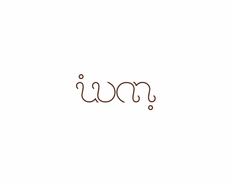
Rokac
by Rokac • Uploaded: Jun. 20 '10

Float
(Floaters:
44 )
Description:
Story (symbol): With my new symbol I wanted to describe myself and identify what I do. I'm a tall, a bit slim guy (hence the tall and thin letter "R"). I've added the serifs to emphasize stability, balance that refers not only to my private life but also to my work, my designs. The Face silhouette that appears in the negative space of the letter "R" represents me (Roko) and logos, the faces of the companies.
Type is made from scratch to match the symbol.
As seen on:
rokac.com
Status:
Client work
Viewed:
3615
Share:


Lets Discuss
I like your new mark. Like to see some other options for the type.
Reply%5EI agree completely with Mike. Mark is very nice, but type is not there yet IMO.
ReplyReally like where you are going with this one rokac.
ReplyLove the mark and the type. Agreee with the guys %5E.
ReplyIMO...the face element of R is great but making the face look away form the type is giving an uneven fell to the logo structure. I dig the concept. how about stacking the type towards the left of the mark?...will that help...maybe the type is right, jus the placement needs a lil shake up...IMO
Reply%5E Agree with the above, but the mark is awesome Roko. Hope to see yr site soon!
ReplyMike, Joe, Alex, Breno, Nitish,Milosz*Thank you all for your thoughts. Much appreciated.*I'm working on the type as we are speaking:)*@nitish*Great thinking buddy, will try to move the type on the left of the mark. Thanks.*@milosz*Cheers my friend. Web site coming soon:)
ReplyGreat Mark Roko (Y)
ReplyI think the 'K' is weak and the R (for me) needs to at least hint at the basic shape of the R mark.
Replylove the mark
ReplyThanks again guys on your thoughts and support.*Working non stop on the new type:)*@Anthony*I think you're right buddy, %22k%22 is getting too much attention:)*@gravitart*Thanks for your support mate. To all potential clients: *Please wait until I finish with the typography:)
ReplyLove
ReplyThe %22R%22 is really beautiful. Type needs some attention imo. :)
ReplyThanks dbunk and fanego:)*
ReplyI have updated the type. Made it from scratch and it wouldn't be so pretty:) if grande Mike (Logomotive) haven't helped his advices and support. Thanks again teacher:)*Big thanks also to nitish.b for his suggestion. Looks much better this way. Thanks buddy:)
Replygreat new id man! really like it.
ReplyThanks Lecart. Just finished designing business card. Can't wait to print them:)
Replyyup very cool, typography and mark matches perfectly! %3D)
ReplyShow us the business cards Roko (:
ReplyI really like the pencil tip to pencil end graphic you have on rokac.com, that is much stronger conceptually -- at least for me.
Replyvery very nice. i like it:)
ReplyThanks again guys.*@milosz*I'll put some pics of cards as soon as they are done:)*@Raja*Thanks for your thoughts. But don't do this to me, I'm still trying to figure out how to tell him that he's being replaced:-)*Btw a friend of mine made this for fun: Kinda cool:)*http://www.screencast.com/t/YzQ5MmJmYmE*
ReplyReally nice work Roko.
ReplyThanks again Mike:)
ReplyAnytime my friend. In fact this would make a nice typeface, very original.
ReplyCheers Mike. To tell you the truth I was thinking about that and it would present a great challenge and satisfaction for me. Time is not on my side but I'll definitely put it on my %22to do%22 list:)
Replyhey the new type is great, cheers
ReplyThanks Florin. At the moment I'm working on a typeface based on the %22Rokac%22 type. Hard work I have to admit:) My respect to all typeface designers out there.*
ReplyThink this is great
ReplyThis came out nice.
ReplyThanks a lot Jared and Pierro.
Replyi really don't know how did i miss this one. great work! i like how the face is also involved in the k letter, really really nice!
ReplyMuch appreciated Alex:)
ReplyPlease login/signup to make a comment, registration is easy