Description:
Story: With my new symbol I wanted to describe myself and identify what I do.
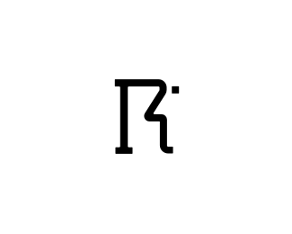
I'm a tall, a bit slim guy (hence the tall and thin letter "R"). I've added the serifs to emphasize stability, balance that refers not only to my private life but also to my work, my designs.
The Face silhouette that appears in the negative space of the letter "R" represents me (Roko, yes I have slightly bigger nose:) and logos, the faces of the companies.
The eye is deliberately in shape of a square (squares are an important part of the visual identity of my country, Croatia).
As seen on:
rokac.com
Status:
Client work
Viewed:
5952
Share:


Lets Discuss
i dig this, very good idea
ReplyThanks Floris:)*Info added. *As Twain or Voltaire would say it: %22I am sorry to write such a long info. I didn't have time to write a short one.*Cheers all and thanks for your support.
ReplyClever man. I really like it!
ReplyThanks Kevin, much appreciated:)
ReplyI love the idea of black R on white background :D Great mark anyway.
Reply@Gotty*I think there should be more letters %22R%22 on a white background out there:)*Thanks mate!
ReplyI think it works really well as a monogram. The slab serif gives it balance and reliability but the shape is quite modern. And the side-profile outlined face makes it feel more personal and friendly like the old Mac logo. **
ReplyThanks for your kind words Colm:)
ReplyLovely mark Roko!
ReplyThanks Mads!
ReplyThanks thisGuy! Much appreciated:)
ReplyNice story... pretty handsome logo I guess :)
ReplyClever mark roko.
ReplyCheers Noetic. Yep, he's as handsome as I am:)*Thanks Andrej my friend.
ReplyHey Serene, of course I remember you. So after all it is you:) I was wondering if that is you moving around the Logopond:) How are you buddy?*Thanks for your kind words and yep, I'm pretty satisfied with my personal identity. At least for now:)*As for the %22place%22 I understand you. After all it's up to you. I quit there 5months ago.*Again good to hear from you... *
ReplyOuu... this is sweet. :D
ReplyThanks Josiah:)
ReplyYour initial is superb, works very well.
Reply%5E%5E agree, very recognizable. oh man faved it but forgot to float, now it float 1 %3B)
ReplyWow, come on you guys, now I'm all blushing:) Many thanks for your support, means a lot!
ReplyWith that said the monogram makes quite some sense. Great work amigo.
Reply%5EThanks a lot Gert!
ReplyVery nice man, I think it's pretty much memorable.
ReplyAfter all this time I have just realised there is a face in there!
ReplyGert,Richard,*thanks a lot guys!
Replytop notch stuff my friend!
ReplyThank you my good friend!:)
ReplyPlease login/signup to make a comment, registration is easy