Description:
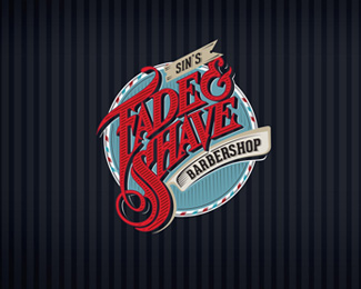
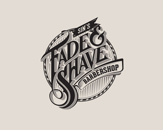
What makes Sin’s Fade & Shave Barbershop branding project unique is that it is a modern take on a retro styled logo The handcrafted script was laid out to highlight the characteristics of movement, distinguished gentlemen, barber retro, and class presented in a theatrical way To emphasize this we connected the letters “F” and “S” to resemble long, flowing hair The rest of the Fade & Shave type was designed to resemble several iconic haircuts, including the pompadour The details and contouring in the type helps to enhance the overall style and feel of Sin’s Fade & Shave Barbershop To go a step further to accentuate the Sin’s Fade & Shave Barbershop brand I designed and developed a pattern to accent a wholesome branding environment
As seen on:
wwwroboliver3com
Status:
Client work
Viewed:
5725
Tags:
•
Rob Oliver
•
Rob Oliver 3
•
RO3
Share:
Lets Discuss
Please login/signup to make a comment, registration is easy