natborn (updated)
by Rincon • Uploaded: Dec. 17 '09
")
Float
(Floaters:
6 )
Description:
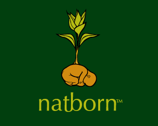
illustrated logo made for a vegetarian association
Status:
Nothing set
Viewed:
2202
Share:


Lets Discuss
some adjustments, less aggressive in comparison with the previous version*seen at: http://logopond.com/gallery/detail/87706
ReplyI just think it looks too...creepy. Reminds me of that photography of the babies in the lettuce, as seen on the episode of Friends where Joey got that girl roommate who had potpourri and Joey realized he had become a woman. I think you can make this idea work, but maybe do a bit more stylized baby instead of a realistic approach.
ReplyI like it! nice, Rincon!
ReplyI think if you made this look more like an alfalfa sprout, you'd be OK. Curvy green shoots -- many of them -- would be good too.
Reply...ever put together a 'mood board'..? Gather elements that exemplify the organization, look at what makes them what they are, draw on those elements, incorporate them into your design.
ReplyThis is still quite disturbing. Big plants growing on humans that is. Perhaps consider wrapping the baby in a leaf or placing it on a leaf instead. I would just try and make it not look like the leaf and the baby are connected.
ReplyBorn cute, I like this one to the other version.
ReplyNice one, indeed, Anthony!
ReplyPlease login/signup to make a comment, registration is easy