ClearData
by Raja • Uploaded: Feb. 12 '08 - Gallerized: Feb. '08

Float
(Floaters:
20 )
Description:
Still working on this, thought I'd get some feedback in the process
I am well aware of the printing issues.
As seen on:
www.rajasandhu.com
Status:
Nothing set
Viewed:
8355
Share:


Lets Discuss
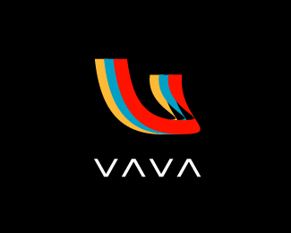
Interesting and engaging type treatment. Especially those a's. Something about the logo mark isn't quite right for me yet. It may have to do with the way those tube/hot dog shapes are all condensed and stretched and stuff. What if you make a tube/hot dog shape out of two of those a's in the type? Meaning if you took the two a's in 'data' and then flipped the right one vertically and then merge the two together you would get a similar like base shape as being used now to form the icon. Does that make sense? This would also help the icon relate back to the type treatment. If this doesn't make sense, shoot me an email with an EPS file, and I'll mock it up for ya. %3B-) All in all, I think this concept will work.
ReplyIn much agreement. I had the same thought even before I read your post but i was thinking that you could keep the icon in the same place. form it out of the %22a%22 shape and have it end at the last %22a%22 in data. ??
Replythose are interesting points - thanks guys, since this is a WIP I will have the chance to try out your suggestions!
ReplyThe type is interesting but, in my opinion, the symbol doesn't work beside it. Somehow the symbol and the type fails to become a whole...
ReplyI think OC's suggestion could correct that- thanks, Respiro
Replylol dache sinkin this one too haaha
ReplyLOL!! Yea, Raja, you suck dude.
Replyhey raj, nice type man. out of curiosity, how'd you decide when to use a gradient for a piece of the mark and when not too? actually now that i look at it closer, i think some of the gradients aren't as obvious as others is all.
ReplyThe colors are gorgeous.
Reply*Creative. Great job Raja
ReplyPlease login/signup to make a comment, registration is easy