Lake Realty Brand
by Quinton • Uploaded: Jun. 13 '18


Float
(Floaters:
1 )
Description:
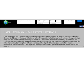
As a real estate agency in Lake Norman, North Carolina, there is constant, intense competition for the Lakefront listings. This brand needed a logo that would stand out, be differentiated from the competition, and work across a wide range of marketing mediums.
To give you an idea of the flexibility requirements of this logo, it is currently being used on business cards, business vehicles, real estate 'for sale' signs, and across about 50 different web properties (some owned by the company and on many third-party companies such as realtor.com).
This meant that the logo needed both a square and a horizontal orientation. This design, allows the company to use the colored part of the logo for square needs, and then include the tag line of "with us it's simple" in situations that allow a horizontal logo.
The colors are chosen in the companies palette and are designed to evoke a sunset over the waters of Lake Norman. For anyone who has ever visited the lake, the sunset is where you fall in love and decide to move to the location. This logo captures that feeling in a tiny footprint.
This logo was not designed by our company. It is used in one of our client's existing marketing campaigns, and is an excellent study in proper color palettes and an extremely versatile logo design.
http://lakerealty.com/
See our Previous Design: https://logopond.com/Quinton/showcase/detail/284126
As seen on:
LakeRealty.com
Status:
Client work
Viewed:
642
Tags:
realtor
Share:

Lets Discuss
Please login/signup to make a comment, registration is easy