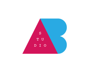
Description:
ABStudio
Status:
Unused proposal
Viewed:
9447
Tags:
ABStudio
Share:





Lets Discuss
Colors are good, and also the concept. I only think the bottom half of the \'B\' needs to be bigger than the top half. And the top half needs to be slightly more possitioned to the left than the bottom half.
ReplyThan it looks optical right than technical (as it is now).
That\'s right, the B is too large on the top, the balance is not perfect with the A.
ReplyThanks for your comment, i appreciate that :)
Really like this one!
ReplyThanks Flyartur !
ReplyLooks too much like the french AB Groupe
Replyhttp://en.wikipedia.org/wiki/AB_Groupe
Hi Creatiolab,
ReplyI\'m not really agree with you, ok the letters are the same but the colors are different from my logo and the concept is not really the same...
But thank you for your comment ;)
^ The logos might not be exactly the same, but I have to agree with creatiolab.
ReplyWhat is the concept?
ReplyWho added this? No offense but not gallery worthy IMO.
ReplyKinda agree with Mike =/
ReplyPlease login/signup to make a comment, registration is easy