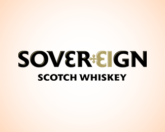
Description:
A proposal for a new brand of scotch whiskey which is seeking to appeal to a female market.
Note: The letters E and I form a crown
Status:
Work in progress
Viewed:
2098
Share:
Lets Discuss
It's awesome in terms of graphics, but in my opinion the message could be more %22manly%22, my first association is King - e.g. male. But the typo is more female-ish though..
ReplyWell it is supposed to appear feminine, that is what the client wanted. To flip your comment on its head, how do you think it could be more feminine although not to the extent that it becomes pink and flowery?
ReplyTo me, the typo does look feminine right now. But my association with the crown is manly, I mean - it's not a tiara, which is the women symbol, but a crown. On the other hand, the name fits perfectly with the crown.. **What comes to my mind thinking about %22sovereign%22, %22women%22 and %22whiskey%22 is feminism, women emancipation and independence. Whiskey is the Man's Land you know, so then Sovereign could be the women emancipation in the land of Whiskey :)**I can't say this is a critique, more like something that catch me when I saw the logo and then read the description.**A quick idea could be a little tweak on the %22G%22, integrating a really hidden venus symbol on the right side.**But still - despite my first associations with the crown - I really enjoy the way of incorporating it in the logo!
ReplyPlease login/signup to make a comment, registration is easy