Phane ( Signature )
by Phane • Uploaded: Oct. 25 '09 - Gallerized: Oct. '09
")
Float
(Floaters:
34 )
Description:
Draw it on transparent paper , scaned and then I made the last adjusments , of course, in CorelDraw. Lot of work here , because this was the first time when I tried something like this. I like to say that it was worth.
Status:
Student work
Viewed:
14817
Share:


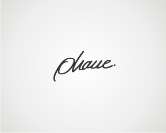


Lets Discuss
It's a little hard to read, but the type as a whole is quite nice.
Replyhehe you should see my real signature , much more complicated.
ReplyI really like the style of the type, but it was just a tad too hard to read. Kind of read Plane until I clicked on it. Throw up another version modifying it a little. Funny that you put a period at the end of your signature also!
ReplyCool, but hard to read :)
Replyi don't know what to do :) 'cause my real handwriting is also hard to read... i'm a hard to read person .. maybe it%3Bs better in this way. Thanks for the comments !
Replyit really is very 'flow-y'....nice looking. Not all that legible, but for artistry, it's a winner.
ReplyI think you need to redraw your P. It looks too much like an O. Keep the rest as is but try a few variations of the P.
ReplyHmm, I actually like the P here. To me, that was one of the more memorable letters.
ReplyTo me it reads, Ohaue... : /
Replywow... the gallery :) Thanks.
ReplyA tad hard to read, but I really like the flow. Good job dude.
Replynice type
ReplyI read phaue. The n looks like a u, but I would leave it that way. Some folks can read it and it looks like it suits your personality. *.Great logo
ReplyNice.
ReplyAgree with bitencourt, cool but hard to digest.
ReplyYou already know my thoughts on this one, i'm still going to float it just beacuse i like the flow of it. :)
ReplyThanks for comments !
ReplyCool
Replydont understand how that pha%22n%22e is an n.. it's clearly a u..
ReplyIt first read as %22dave.%22 Had to stare at it a bit... Great exploration and execution with the custom type!
ReplyHard to read, but beautiful :-)
Replystunning type. but hard to read.
ReplyPlease login/signup to make a comment, registration is easy