Description:
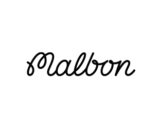
Excited when Los Angeles based Malbon got in touch to have me help with the refinement of their current logo script. While everything was up to debate, the general shape of the “M” had to stay and also decided to keep the “bon” connecting flow to maintain that nostalgic feel to the old script.
As seen on:
https://www.paulvonexcite.com/work/malbongolf
Status:
Client work
Viewed:
2915
Tags:
fashion
•
monoline
•
lettering
•
paulvonexcite
Share:

Lets Discuss
Please login/signup to make a comment, registration is easy