R_M Realtor (Canada)
by Patazae • Uploaded: May. 05 '09

Description:
Client: Real Estate Agent
Designer: Patrick Diagou
Status:
Nothing set
Viewed:
642
Share:


Lets Discuss
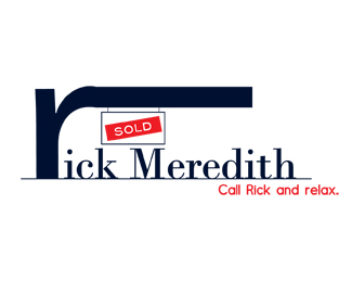
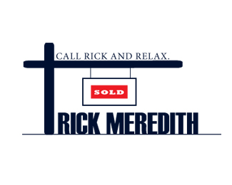
Please guys. Give some feedback. I had a feedback on the other one telling me that the horizontal bar of the sign should be shorter and that I should also write all the text in the sign. Let me know what you think. I will post another one tonight according to the first feedback I got.
Replythe horizontal bar is way too heavy. **with typography, the horizontal strokes are thinner than the vertical strokes to give the impression of visual balance.**work on it a bit more. also, the way the lower serifs do not blend into the baseline keyline, even though they are sitting directly on it, is distracting.
ReplyThanks a lot for your feedback Axl. I will post the modified version tonight. Thanks again.
ReplyI think the problem with both of your logos is that the concepts feel very forced - they're trying too hard. If you look through this site you'll find that the majority of the most successful logos are also some of the most simple ones.
ReplyPlease login/signup to make a comment, registration is easy