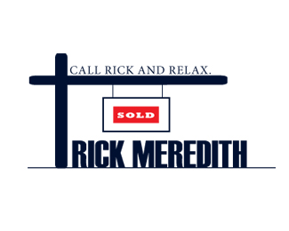
Realtor_2
by Patazae • Uploaded: May. 05 '09

Description:
Client: Real Estate Agent
Designer: Patrick Diagou
Status:
Nothing set
Viewed:
649
Share:


Lets Discuss
I get what you're trying to do, but all of your proportions just look odd. I know it's supposed to be a realtor sign that you stick in the ground, but it looks like it's two feet high and the %22SOLD%22 sign is so small in comparison it just looks lost.**You'd be better off making the vertical post higher/longer and the horizontal post shorter and putting all the type in a sign/box that hangs from the post.
ReplyThank you very much for your feedback. I will try it tonight and post it. Thanks again.
ReplyPlease login/signup to make a comment, registration is easy