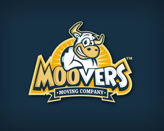
Description:
For a mooving company
(not used)
This one was created for a competition. Not shure what hapend with that comp. I believe it was a trick from part of the client. Is a loooong story...be carefull my friends!!
Status:
Unused proposal
Viewed:
30434
Tags:
funny
•
mascot
•
moving
•
cow
Share:




Lets Discuss
awesome illustration! love it!
Replycool moo!!
Replyvery fun logo, mr. oronoz. nice illustration by the way.
Replylove your illustrations Oronoz, they are always so superbly executed, this top drawer.
Replyi looove it. great job, Alan.
ReplyAlways liked this one Alan.
Reply%5Etough client :)
ReplyHa, love it, Alan!!
ReplyI wonder if this guy will ever make a decision. Seems Sean Brandclay http://logopond.com/gallery/detail/94378 succeeded in the quest, yet have not seen new update. I also did work for him.
ReplyThnxs a lot for all the nice comments guys!! Means a lot!! :D**@Mike...Yeah, i really don%60t understand what was the point of this guy%3B waste our time??*It would be great to know if Sean finally make it!!*And yeaah man I see you proposals for this client, was really awesome!! :)
ReplyGOOD JOB!*
ReplyI love your style Oronoz, you are a true master.
ReplyAlan, Moocho Bueno my friend, too bad clients don't see quality most of the time.
Reply@golnzales...Gracias Juan!*@wow...thnxs a lot gareth, that means a lot!! I Love your work!!*@Rudy...Gracias viejo, totally agree with you :/ i mean, Mike and Sean did a fantastic job to this client and just don%60t get why this guy still keep his old logo :/
ReplyThnxs Radhacelis!! :)
ReplyI've seen a lot of Moovers logos Alan, but this is definitely of my favs. Top work bud.
ReplyThnxs a lot Jose :D
Replynice to see this in the gallery, great work
Replyfunny:)
ReplyJealous if this one Alan.
Reply%5EI believe this is the same client that numerous designers have worked for.
ReplyAnd congrats on the gallery Alan!
ReplyThnxs a lot guys, it%B4s great to see this bad boy in the gallery!! :)*@ vintage_chic...yes is the same client. Long story!! :)*@ Joe...Thnxs for telling me, i didn%B4t notice!! hehe
ReplyYeah Caleb said mine was the last one, not sure though after seeing how great this is.**You can see the one I did in use here: http://www.brandclay.com/blog/wp-content/uploads/2010/08/image003.jpg
Replywell deserved, my friend.
ReplyWe did not take part in the competition, though we did some paid work for the client.
ReplyThis looks like the final logo for these guys. Interesting choice, if I do say so myself. **http://www.facebook.com/pages/Moovers/10150142234110529?v%3Dwall%26filter%3D2
ReplyOne of the reasons I will never enter a crowdsourcing logo contest... ever!
Reply%5E I generally agree, but in this one everybody got paid for their work, so that sounds perfectly fine with me. :) But IMO, the winner isn't as impressive as the other proposals, from a creative point of view, at least.
Reply%5Eno offence to all that got involved... some exceptional talent among them... but I actually really like what they ended up with.
ReplyWell, I'm curious to hear your thoughts%3B as in: why get away from the cow if the name itself implies it? and why ask quite a number of talented designers to do complex designs and in the end settle with a typeface and a maps symbol? not saying the winner isn't strong, i just don't get the whole picture.
ReplyI think it looks killer on the building and works nice. Just wish this would have came out sooner in the briefs. In the end client got what they wanted.
ReplyOh, I misunderstood, great everyone got paid.
ReplyAmigo, check the %60logos%60 section here http://www.waiwe.com/
ReplyDAMN! Thanks a lot for the warning amigo!!
ReplyHi Oronoz!
ReplyLoved your work, It's great.
Pease have a look on below link. Is this you? Or someone using your work???
https://www.odesk.com/users/~0190d33d61b11f044b
Anyway, Keep it up man!
Umar Farooq
Hi Umar,
ReplyIs not me :/ but I already contacted the oDesk people, hope they solved the problem!!
This is brilliant. Has a pun in it and looks awesome. :) Definitely something people will remember
ReplyPlease login/signup to make a comment, registration is easy